

A restaurant logo is the first sentence your brand speaks. Before a diner opens the menu or hears a hostess, the mark is already signaling cuisine, price point, and mood. Fast-casual or fine-dining, the rules are the same: clarity beats cleverness, and consistency compounds. MAVRK Studio builds visual identities for food and beverage founders who want their logo to pull the right customers through the door, not just look good on a moodboard.
What Is a Restaurant Logo and Why It Matters
Definition and Core Function
A restaurant logo is a visual mark that fuses typography, imagery, and color into a single, repeatable identifier. It appears on menus, awnings, coasters, delivery bags, staff aprons, and every social post you will ever publish. That range is the job. A logo that only works on Instagram is not a logo, it is a graphic. Work in the hospitality brand space makes this obvious fast: the mark has to survive kitchen grease, embroidery thread, and a 40×40 pixel favicon.
The Business Case for a Strong Logo
First impressions form in milliseconds, and a logo carries most of that weight. It tells a walk-by whether you are $12 tacos or $80 tasting menu before they read a word. Consistent use across touchpoints is what converts recognition into repeat visits, which is why we treat brand identity as a business asset, not a decoration. A muddled mark does the opposite: it invites the wrong customer and confuses the right one.
Takeaway: treat the logo as a positioning device, not a mood piece. If it does not clarify who you are for, it is not finished.
Key Elements of Effective Restaurant Logo Design
Typography Choices
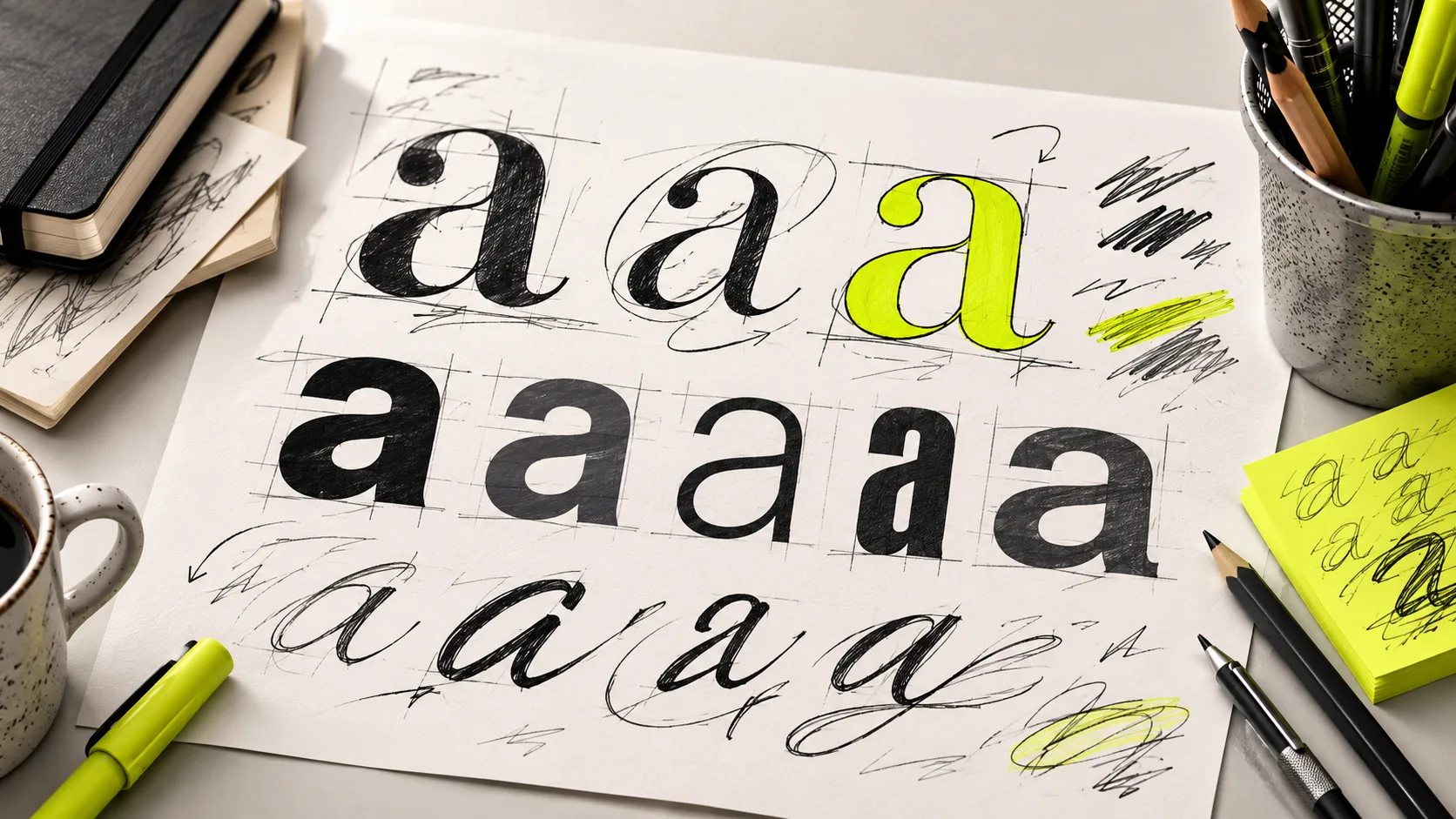
Type does the heavy lifting. Thin serifs and script faces read as elegant and considered, which is why they show up on fine-dining wordmarks. Bold sans-serifs and slab serifs read as loud, fast, and cheap, which is why they show up on burger joints and taquerias. The brand strategy work has to decide which register the room needs before a designer opens Illustrator.
Color Psychology for Food Brands
Red and orange lean into appetite and urgency, which is a large part of why fast-food global chains keep landing on them. Green signals fresh, healthy, and plant-forward. Black, cream, and metallics telegraph premium. Warm neutrals feel artisanal. Pick a palette that agrees with the plate, not one that fights it. Our category branding notes get into the psychology in more detail, but the rule of thumb: colors should reinforce what the kitchen already does.
Iconography and Symbols
Chef hats, cutlery, flames, coffee cups, pizza slices, fish silhouettes, wheat sprigs. The vocabulary is well-established, which is a double-edged sword. Genre-specific icons earn instant recognition, but they can also make you invisible if every neighbor uses the same asset. Combination marks (icon plus wordmark) are the most versatile format because they collapse cleanly into an app icon and stretch across a building sign. Look at built-out client identities to see how icon and wordmark can operate independently and together.
Takeaway: typography sets tone, color sets appetite, iconography sets category. Get those three lined up and the logo almost designs itself.
Sample Restaurant Logo Design Styles by Cuisine and Concept
Fine Dining and Upscale Restaurants
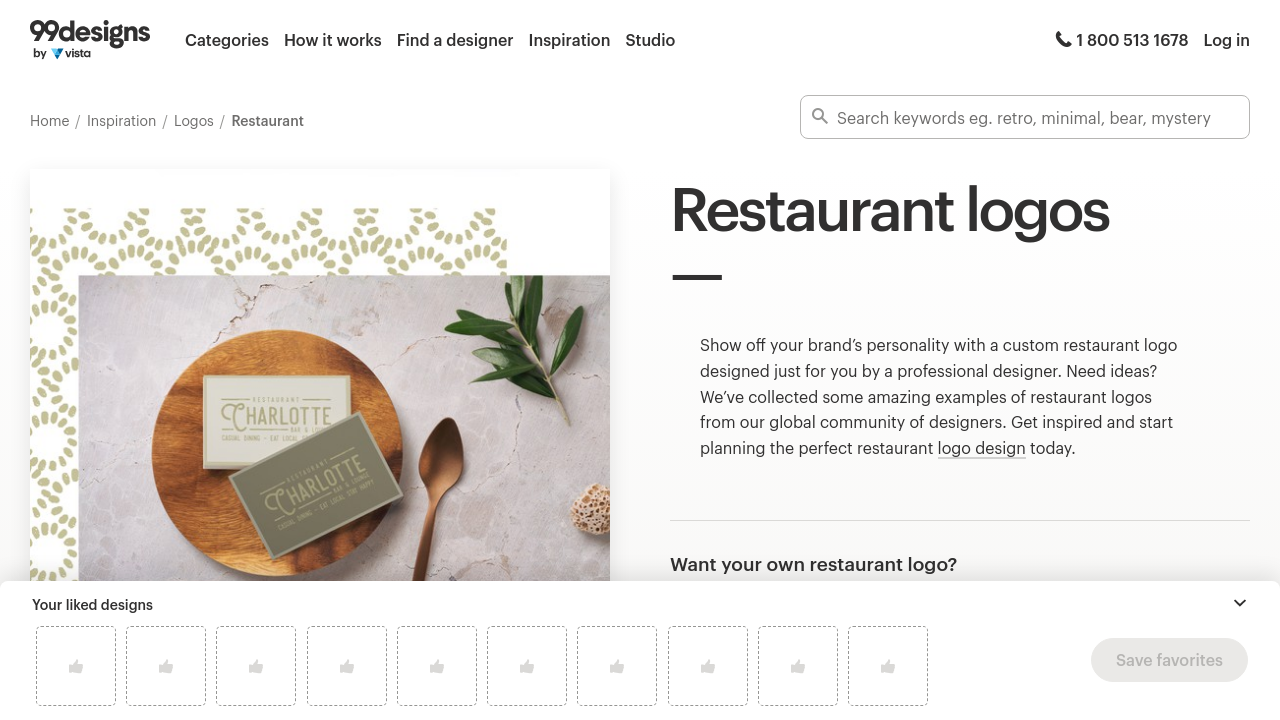
Fine-dining marks lean quiet. Monograms, crests, minimal wordmarks in thin serif or engraved styles, muted palettes, occasional metallic accents. The design job is restraint. See how a considered wordmark carries a premium hospitality identity without a single flourish. If you have to shout that you are expensive, you probably are not.
Casual and Fast-Food Concepts
Casual concepts get to have fun. High-contrast color, chunky type, mascots, illustrated icons, motion, energy. The goal is approachability at a glance from a car or a food-court queue. Bright palettes and hand-drawn assets like the ones cataloged across 99designs’ restaurant logo inspiration show how much visual noise a fast-casual mark can carry without breaking. Our creative agency notebook has more on when to push maximalism and when to pull back.
Cafes, Bakeries, and Specialty Food Shops
Cafes and bakeries live in a warmer register: hand-drawn type, vintage stamps, cream and terracotta palettes, illustrated cups and wheat. The aesthetic signals craft and small-batch care. Seafood concepts pull nautical (anchors, waves, fish). Regional cuisines (Mexican, Italian, Japanese) often borrow flag colors or culturally specific motifs, though the good ones treat those references with a light touch. A venture-building lens can help align the visual language with the concept before it ever hits print.
Takeaway: cuisine style is a genre. Respect it, then find the small twist that makes the mark yours.
Common Mistakes to Avoid in Restaurant Logo Design
Overcomplicating the Design
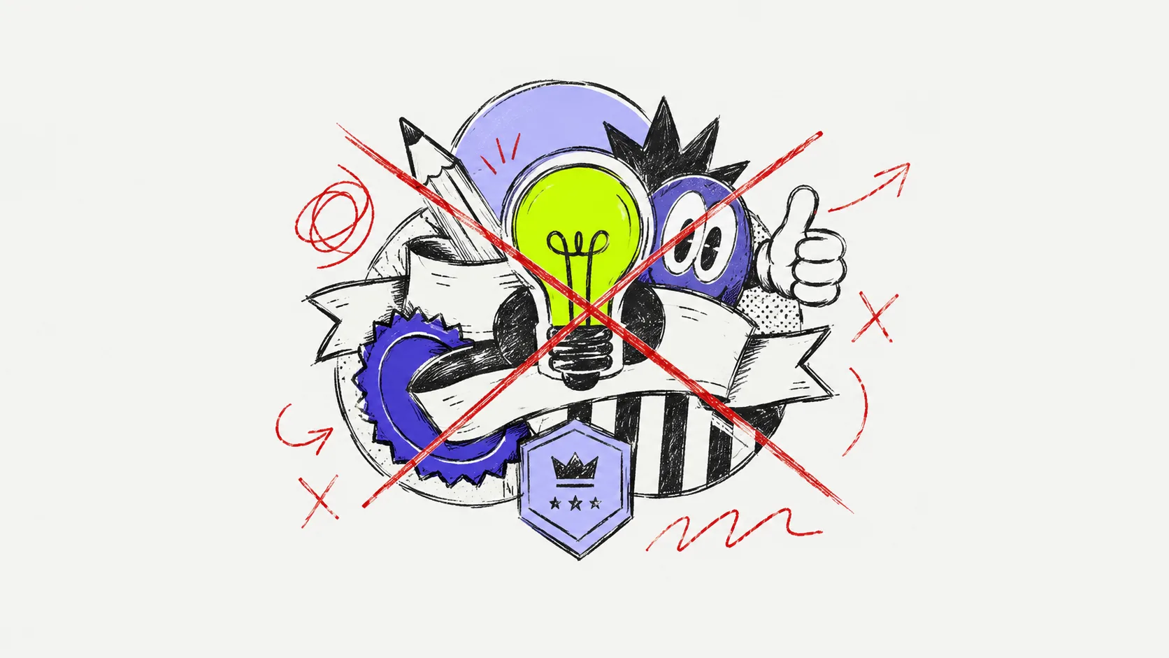
The most common failure mode is stuffing too much in. Three typefaces, five colors, a mascot, a banner, a founding date, and a tagline. Nothing reads. A logo has one job at a glance. Founders often make this mistake because they are trying to communicate everything the restaurant is in one graphic, which is exactly why our product branding mistakes breakdown exists.
Ignoring Scalability and Versatility
A logo built only for a website will collapse when it needs to be embroidered on a chef coat, etched on a glass door, or squeezed into a 200×200 profile image. You need vector files, single-color variants, and a mark that survives at both billboard and business-card size. Our launch process treats scalability as a first-round requirement, not a polish step.
Chasing Trends Over Timelessness
Trend-driven designs date fast. The geometric gradient of 2019, the ultra-minimal sans of 2021, the retro ’70s revival of 2023. Each one aged in about eighteen months. A restaurant logo needs to last five to ten years to earn its investment back, which is why the 90-day brand system anchors identity in positioning first and aesthetics second.
Takeaway: simple, scalable, and slightly boring beats clever and dated. Aim for a mark that will still look right in a decade.
How to Brief a Designer or Start Your Restaurant Logo Project
Gathering Brand Reference Material
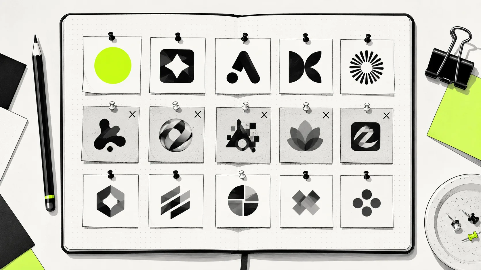
A useful brief starts before you talk to a designer. Pull three to five logos you admire, three to five you dislike, and a handful of competitor marks in your market. That set alone gives a designer more direction than a page of adjectives. Reference material for CPG-adjacent food brands can also be useful even for a restaurant, because the packaging discipline is tighter.
What Information to Provide
Include cuisine type, target demographic, price point, service style (counter, table, delivery-heavy), desired mood, and any non-negotiable elements like a family name or heritage detail. Share competitor logos so the designer can spot white space in the local market. The studio’s approach treats the discovery call as the actual first design step.
Reviewing and Refining Concepts
Expect multiple initial concepts and two to three structured revision rounds. Feedback should be specific (“the serif feels too formal for a taqueria”), not vague (“can we make it pop”). Deliverables should include vector source files (AI, EPS, SVG), transparent PNGs, and single-color versions. DIY generators can produce fast starting points but rarely deliver differentiation. For more on that trade-off, see our ventures blog.
Takeaway: a good brief is 70% of a good logo. Do the homework before the kickoff call.
Bringing Your Restaurant Logo to Life Across Brand Touchpoints
Consistency is where logos earn their keep. The mark should apply cleanly across menus, exterior signage, social profiles, packaging, uniforms, delivery packaging, and digital ads. A brand guidelines document, even a two-page one, prevents the drift that turns a sharp identity into a fuzzy one over a year of ad-hoc use. Real-world application work like Reali’s rollout shows how a single mark stretches across dozens of surfaces without breaking.
Menu design, business cards, and loyalty cards are the early extension points where cohesion pays off fastest. Social profile images need a simplified or icon-only variant that stays legible at 200×200 pixels, and seasonal variations (holiday, anniversary, collab) should stay anchored to the core mark so recognition compounds instead of resetting. Our packaging category covers how to extend a food logo onto physical goods without losing the plot.
Takeaway: the logo is the anchor. Guidelines, variants, and disciplined application are what make it worth what you paid for it.
At-a-Glance: Logo Styles by Concept
| Concept | Typography | Palette | Common Icons | Logo Type |
|---|---|---|---|---|
| Fine dining | Thin serif, engraved | Muted, metallic, black | Monogram, crest | Wordmark or monogram |
| Fast-casual | Bold sans, slab | High-contrast, red/orange | Mascot, illustrated food | Combination mark |
| Cafe / bakery | Hand-drawn, vintage script | Cream, terracotta, warm neutrals | Cup, wheat, leaf | Emblem or combination |
| Seafood | Nautical serif | Navy, white, sand | Fish, anchor, wave | Combination mark |
| Regional cuisine | Culturally specific display | Flag-adjacent or heritage | Motif-driven | Emblem or wordmark |
Frequently Asked Questions
What should a restaurant logo include?
At minimum, a legible wordmark, a coherent color palette, and an icon or symbol that can stand alone. Fine-dining brands can skip the icon; fast-casual concepts usually cannot. Everything else, including taglines, is optional.
How much does a restaurant logo design cost?
Prices range from under $100 for DIY generators to $500 to $5,000 for freelancers and $10,000-plus for full identity studios. Full-system engagements from a studio like MAVRK’s pricing tier include strategy, guidelines, and application, not just the mark.
What are the best colors for a restaurant logo?
Red and orange stimulate appetite and dominate fast-food branding. Green signals fresh and health-forward. Black and cream read premium. The right answer is whichever palette reinforces your cuisine and price point rather than fighting it.
What font styles work best for restaurant logos?
Thin serifs and scripts suit fine dining and cafes. Bold sans-serifs and slab serifs suit fast-casual, burgers, and taquerias. Hand-drawn or vintage lettering fits bakeries and specialty shops. Match the type to the plate.
How do I create a restaurant logo for free?
Free tools like Canva, Looka, and LogoDesign.Net can produce starting points in minutes. They rarely produce differentiation. Use them for temporary marks or moodboarding, and plan to invest in a custom identity once the concept is validated.
What file formats do I need for my restaurant logo?
Ask for vector source files (AI, EPS, SVG), transparent PNGs at multiple sizes, full-color and single-color variants, and a PDF specimen sheet. Anything less and you will get stuck the first time a signmaker or embroiderer asks for artwork.
How long does it take to design a restaurant logo?
Two to six weeks is typical for a professional engagement, depending on revision rounds and the scope of the identity system around it. Rushed logos usually get rebranded within eighteen months, so budget the time.
Can I use a template logo for my restaurant?
Technically yes, but you risk sharing your mark with another restaurant in a neighboring market. Templates work as placeholders. For anything you intend to invest signage and packaging money into, commission original artwork.
Closing Thought
A logo is the smallest, hardest-working asset in a restaurant’s brand system. Get it right and every touchpoint compounds recognition. Get it wrong and every new menu, sign, and social post reinforces the confusion. If you are building a new concept or refreshing an existing one, MAVRK Studio works with hospitality founders on identities designed to hold up in the dining room, on the shelf, and in the feed.