


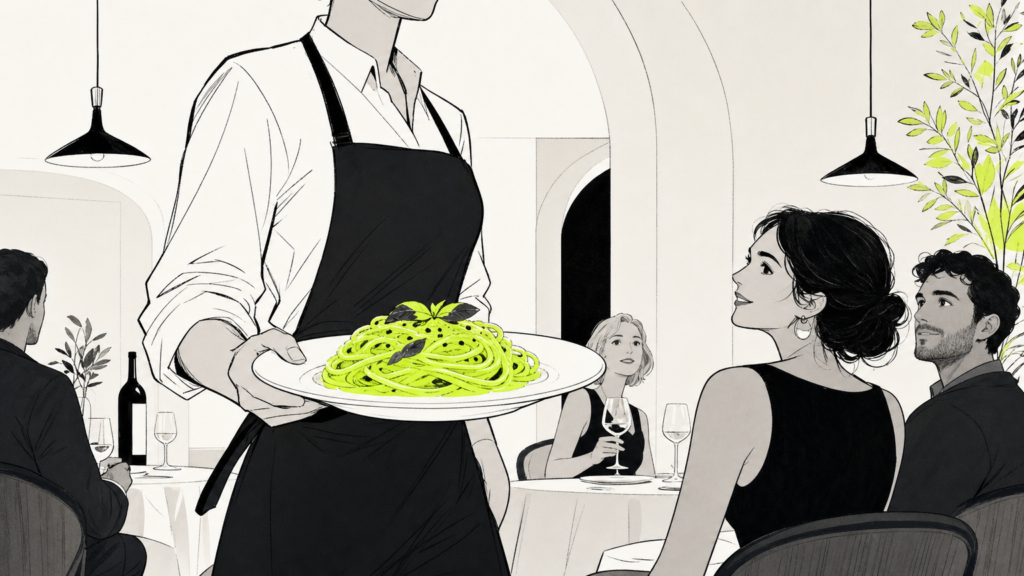
Italian restaurant branding is the craft of translating a cuisine’s cultural depth into a visual and verbal identity that pulls guests in before the first bite. Trattorias, tasting rooms, and fast-casual pasta bars all live or die on this signal. A tight brand tells people what to expect, sets the price ceiling, and builds the Tuesday-night loyalty that keeps lights on. MAVRK Studio works with hospitality and consumer founders to build identities that turn browsers into regulars.
What Italian Restaurant Branding Actually Means
Branding is not the logo. It is the whole system a guest reads, consciously or not, from the sidewalk to the plate. That system tells them whether the tiramisu is $9 or $19, whether the wine list runs deep, and whether the room welcomes a t-shirt or asks for a jacket. Studios that specialize in this work, like the teams profiled in this breakdown of how restaurant branding agencies build profitable brands, treat identity as an operating asset, not decoration.
Beyond the Logo: A Full Identity System
A full identity covers the logo, type system, color palette, menu design, packaging, uniforms, signage, and the tone of voice on Instagram and the answering machine. When any piece drifts, the whole read gets fuzzier. Founders who want a deeper primer on that principle can start with our restaurant branding overview, which lays out the touchpoints most operators forget until year two.
How Branding Shapes Guest Perception Before Arrival
Most guests decide the vibe before they walk in. A photo carousel, a Google Business Profile header, a delivery-app tile: each one signals price and cuisine style in seconds. Consistency across those surfaces builds trust, and trust is what closes the reservation. The role of brand identity in hospitality is less about ornament and more about giving a stranger enough evidence to say yes.
Takeaway: Audit every surface a first-time guest sees before arrival. If any one of them contradicts the others, that is where the money leaks.
Core Visual Elements of an Italian Restaurant Identity
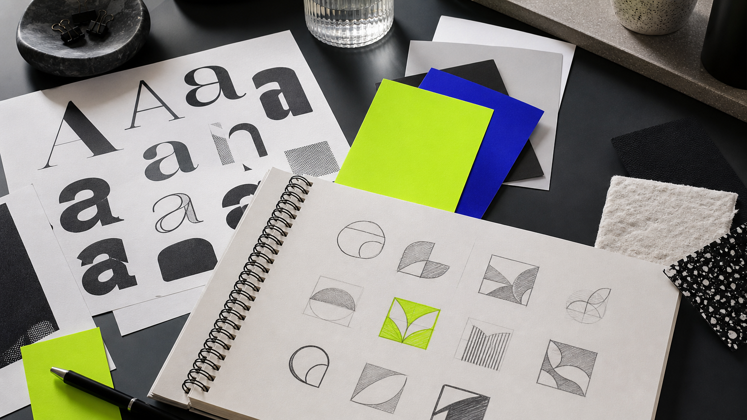
The visual toolkit for an Italian concept is broad, but the choices split fast along the fine-dining-to-fast-casual spectrum. Every element should be selected against a positioning target, not personal taste. Our guide to designing a brand logo walks through that discipline in more depth.
Typography: Serif Traditions vs. Modern Sans
Serifs like Garamond, Bodoni, and Didot tap old-world Italian printing and read as heritage. A bold geometric sans reads as new-school and often suits fast-casual pasta bars, aperitivo bars, and pizza-by-the-slice concepts. The single most cost-effective move any operator can make is pairing one display face with one workhorse body face and applying that pair everywhere. Studios like the team behind Reali show how a disciplined type pairing carries an identity across menus, signage, and digital assets without new design work.
Color Palettes That Signal Italian Heritage
The default palette runs terracotta, cream, forest green, and deep red. Luxury concepts pivot to black, gold, and ivory. Coastal and Amalfi-leaning brands push into cobalt, lemon yellow, and off-white. Look at how food and beverage brands like Edenesque hold a narrow palette across print and pack; that discipline is what separates an identity from a moodboard.
Logomark Styles: Wordmarks, Crests, and Illustrative Marks
Crests and shields borrow from Italian heraldry and telegraph heritage. Wordmarks suit minimalist, modern-Italian concepts where the name itself carries the poetry. Illustrative marks, custom pasta shapes, olive branches, Vespa silhouettes, a hand-drawn regional map, add character stock icons can never touch. Bespoke illustration is one of the highest-use moves for the price, as our portfolio work demonstrates across food and beverage clients.
Takeaway: Pick a type pair, a palette of four to six colors, and one logomark family, then hold the line. Consistency beats cleverness across a two-year window.
Positioning Strategy: Finding Your Italian Restaurant’s Lane
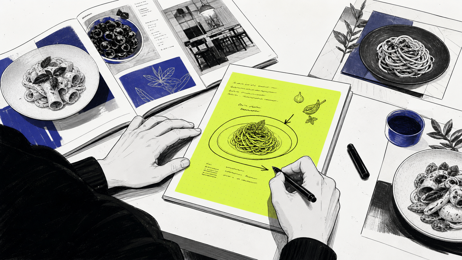
Italian is one of the most crowded categories in almost every metro market. Without a clear lane, a new concept lands as “another pasta place.” Positioning is the fix, and it happens before any pixel gets pushed. Founders can pressure-test their thinking against the brand-builder vs product-pusher framework to make sure they are building an identity, not just selling a dish.
The Positioning Spectrum: Rustic Trattoria to Modern Fine Dining
Pick a region, a price point, and a mood. Roman cacio-e-pepe counter, Sicilian seafood osteria, Northern Italian tasting menu: each demands a different visual grammar. Rustic trattorias lean handmade, warm, and slightly imperfect. Modern fine dining leans quieter, more editorial, more white space. Our 90-day brand system forces those choices early so design decisions have a spine.
Naming, Taglines, and Verbal Identity
A name that borrows an Italian place, a family surname, or a culinary term (al dente, locanda, osteria, quattro) anchors story in one word. A tagline should carry the emotional promise, conviviality, craft, heritage, in five words or fewer. Verbal identity extends into menu copy, staff scripts, and the caption voice on social; brands that treat social channels as brand real estate get more mileage from every post.
Competitive Differentiation in a Crowded Category
Run a competitor audit across Google Maps, Yelp, Resy, and local Instagram. Screenshot the top ten Italian rooms in a five-mile radius. Patterns will emerge: everyone using the same warm-red-and-cream palette, everyone leaning on the same Trajan-adjacent serif. That pattern is the white space to attack. Concepts like Cha Lab show how a bolder verbal and visual posture separates a food and beverage brand from the pack.
Takeaway: Write a one-sentence positioning statement before any design starts. If it fits on a napkin, the identity has a chance.
Applying the Brand Across Every Guest Touchpoint
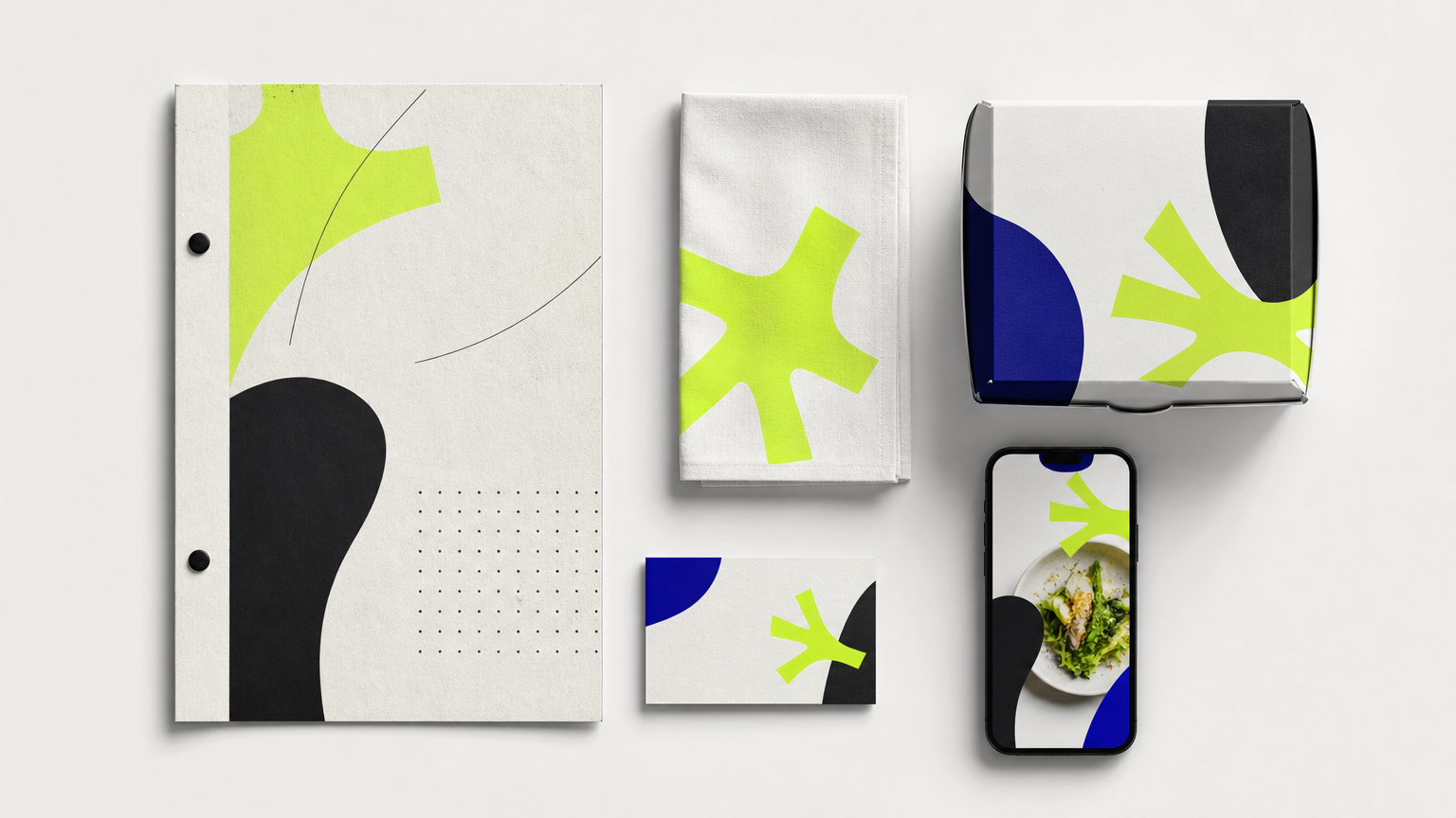
An identity earns its keep in application. The system has to hold across print, on-premise, digital, and third-party platforms without breaking. That is where most restaurant brands quietly fall apart. A phased rollout, guided by clear brand application standards, is how disciplined operators keep the system tight through year one.
Print Touchpoints: Menus, Packaging, and Signage
Menu design is the highest-ROI print touchpoint on the property. Layout, paper stock, and typography move average check size, and menu engineering research from Cornell’s hospitality program has repeatedly linked layout choices to per-guest revenue. Packaging for takeout and delivery is the second storefront; a stamped kraft bag with a strong wordmark outperforms a blank clamshell every time. Studios that publish pricing guides for restaurant branding work can help operators scope print production against the full identity budget.
Digital Touchpoints: Website, Social Media, and Delivery Platforms
Social templates built from the core brand system let a hostess or a marketing coordinator produce on-brand posts without a designer in the loop. Delivery platform tiles on Uber Eats and DoorDash function as a second storefront and often get shot in a hurry; that is where identity discipline slips. A branded website with consistent fonts, color, and photography converts search traffic into reservations, and the principles behind must-haves for a modern site translate cleanly from e-commerce to hospitality.
Takeaway: Build a template library. Menus, social, delivery tiles, email headers. Non-designers on staff should be able to ship on-brand assets without asking permission.
Common Misconceptions About Italian Restaurant Branding
A few tropes keep new operators stuck in the same visual traffic jam. Naming them out loud is the fastest way past. The cost-effective marketing playbook covers a few adjacent traps for founders building on a tight budget.
Misconception: Italian Branding Must Use Red, White, and Green
Reality: The Italian flag palette is the single most overused choice in the category. In dense urban markets it makes differentiation nearly impossible. Color should signal positioning, price, and mood, not nationality. Brands like Folkland show what happens when a palette is chosen for story rather than shorthand.
Misconception: A Logo Is the Whole Brand
Reality: A logo without a type system, palette, and usage rules produces inconsistent applications that erode equity as the business scales. This is one of the most common packaging and identity mistakes we see in food and beverage.
Misconception: Authentic Means Antique
Reality: Modern, bold design can read as authentic without vintage ornamentation. Contemporary concepts prove that a confident sans-serif and a tight photography style communicate Italy just as well as a distressed woodcut. Custom photography tied to the room, the chef, and the actual pasta beats stock shots of the Colosseum every time, a principle that runs through work like The Rice Cream.
Takeaway: If a design decision could apply to any Italian restaurant on the block, it is probably wrong. Specificity is the whole game.
How to Get Started With Your Italian Restaurant Brand Identity
The path from idea to living identity is not mysterious. It runs through a brief, a partner, and a phased build. Operators who want a working framework can start with our CPG and hospitality branding strategy guide and adapt from there.
Defining Your Brand Brief
A usable brief names the target guest, the cuisine positioning, three competitor brands to differentiate from, and two or three adjectives describing the desired feel. Keep it to two pages. Any longer and the team stops reading. Our discovery process walks founders through the same questions.
Working With a Designer or Studio
A specialist studio brings a defined discovery, research, and delivery process; a generalist freelancer often skips the strategy layer. Studios also tend to hand off cleaner guidelines, which pays off every time a new menu insert or Instagram carousel gets built. The MAVRK studio homepage lays out how we think about that scope of work.
Budgeting and Phasing Your Brand Build
Sequence the spend. Logo and core palette first, menu and print second, digital and packaging third. Full identity systems from a mid-tier studio typically include logo, type, color, and a written style guide as core deliverables. Always require the style guide as a non-negotiable, and get in touch with a partner before signing to confirm it is in scope.
Takeaway: Brief, partner, phase. In that order. Skipping any step doubles the eventual rework.
Frequently Asked Questions
What does Italian restaurant branding include?
It includes the logo, typography, color palette, photography style, menu design, packaging, signage, uniforms, website, social templates, and tone of voice. A complete system also documents usage rules so every touchpoint stays consistent as the business grows.
How much does it cost to brand an Italian restaurant?
Costs vary widely by scope and studio tier. A logo-only project from a freelancer can start in the low four figures, while a full identity system with guidelines, menu design, and digital assets from a specialist studio typically runs into the mid five figures.
What colors work best for Italian restaurant branding?
Terracotta, cream, forest green, and deep red anchor traditional concepts. Luxury rooms shift to black, gold, and ivory. Coastal concepts lean cobalt and lemon. The right palette signals price and positioning, not nationality, so choose against your lane, not the flag.
How do I make my Italian restaurant stand out visually?
Pick a specific regional lane, audit local competitors for visual patterns, then choose typography, palette, and photography that break those patterns intentionally. Custom illustration and original photography of your actual room and food are the fastest differentiators.
Do I need a brand style guide for my restaurant?
Yes. A written guide specifying exact colors, fonts, logo usage, and photography direction is what keeps every menu insert, delivery tile, and Instagram post on-brand. Treat it as a non-negotiable deliverable from any branding engagement, not an upsell.
What is the difference between a logo and a full brand identity?
A logo is a single mark. A full identity is the system around it: type, color, photography, voice, and usage rules. A logo alone gives you a symbol; a full identity gives you a consistent experience across every guest touchpoint.
How long does a restaurant branding project take?
A focused identity system usually takes eight to twelve weeks from discovery to final delivery. Fast-tracked projects can compress to six weeks; larger scopes covering website, packaging, and environmental design often stretch to four or five months.
Can I rebrand my Italian restaurant without losing existing customers?
Yes, if you communicate the change and preserve equity cues. Keep one or two recognizable elements, a color, a name fragment, a signature illustration, and roll out the new identity in phases with clear messaging to regulars across email, social, and in-room signage.
Conclusion
Italian restaurant branding rewards specificity, discipline, and taste. Pick a lane, build a system, hold the line across every guest touchpoint, and revisit the whole thing on a yearly cadence as the business scales. That is the difference between a room that fills on a Tuesday and one that empties by month six. If you are ready to build an identity that does that kind of work, MAVRK Studio partners with food and beverage founders to make it happen.