


Fast-food restaurant branding is the coordinated system of visual identity, messaging, and customer experience cues that tells diners who you are before they ever taste your food. In a category where a purchase decision happens in seconds, brand clarity is a direct competitive asset. MAVRK Studio builds identities for restaurant concepts that hold up across every touchpoint, from roadside signage to sauce packets to the digital menu board glowing above the counter.
What Fast-Food Restaurant Branding Actually Means
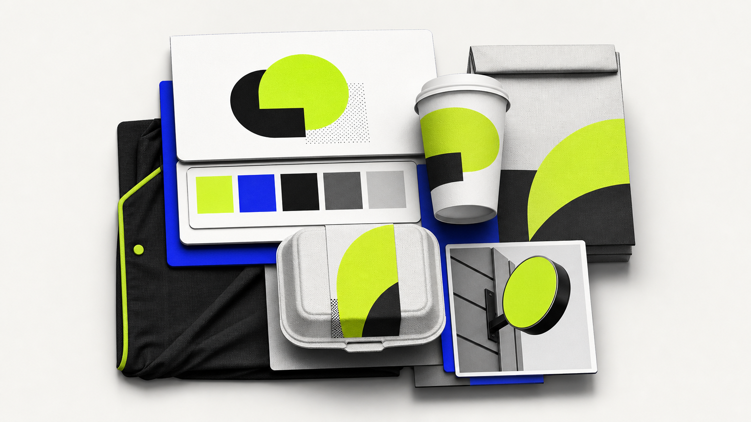
Fast-food branding is not one logo. It is a stack. Logo, palette, typography, packaging, uniforms, signage, environmental graphics, and tone of voice all working as a single system. Get one wrong and the whole thing wobbles. Studios like MAVRK’s restaurant branding practice exist because that stack is bigger than founders expect.
Definition and Scope
The primary job of QSR branding is speed recognition. A hungry customer, glancing at a food-court map or a highway sign, needs to identify and trust your brand in a fraction of a second. Everything downstream, from the burger box to the app icon, has to reinforce that first flash of recognition. Our brand identity guide for hospitality and consumer brands breaks down that stack in detail.
How It Differs from Fine-Dining Branding
Fine-dining identity can whisper. It can lean on subtlety, narrative, and negative space, because the diner has already committed forty-five minutes to reading the menu. Fast-food branding has no such luxury. It has to communicate value, speed, and appetite appeal in one breath, and it has to do it in environments the designer does not control, like a crowded drive-through at dusk. That is why a real restaurant branding agency approach treats environmental design, including drive-through flow and digital menu layout, as core deliverables rather than afterthoughts.
The Core Elements of a Fast-Food Brand Identity
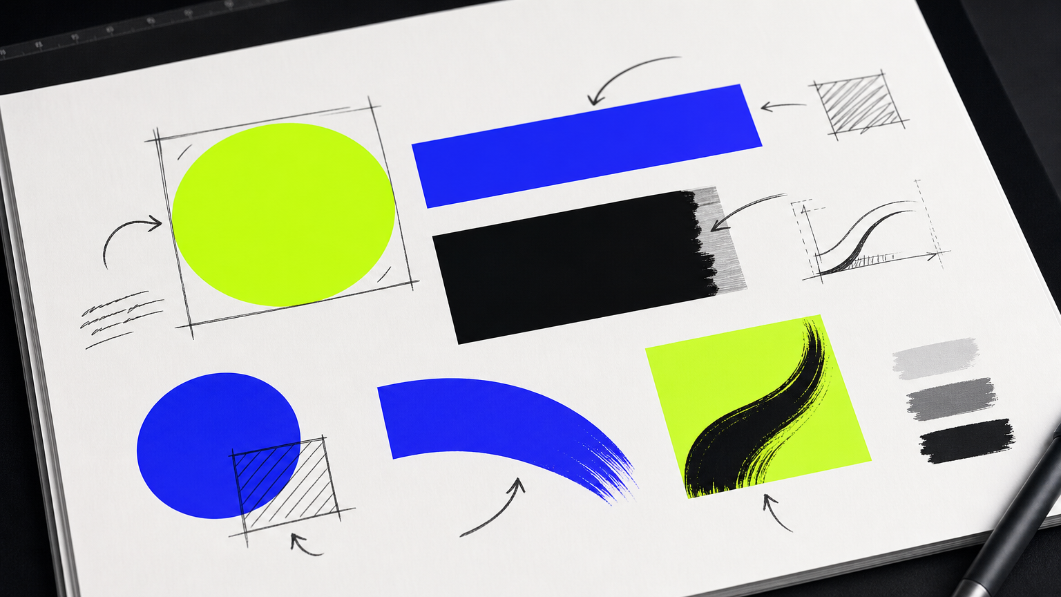
The category has its own grammar. Bold shapes, hot colors, appetite triggers. But grammar is not a formula. The brands that break through use the grammar with intent, then twist one variable hard enough to feel new. Our take on brand-building versus product-pushing frames the mindset behind that twist.
Logo and Color Psychology
Red and yellow dominate the category for a reason. Color psychology research associates red with urgency and appetite stimulation, and yellow with energy and approachability. That is why McDonald’s, In-N-Out, Wendy’s, and dozens of regional players sit in the same chromatic zip code. The logo design craft matters here because color alone is not equity; the mark has to carry its own weight.
Iconic fast-food logos share a discipline: one strong shape that scales. McDonald’s arches, KFC’s Colonel silhouette, Burger King’s bun sandwich. Reproduce it on a billboard or a sauce packet; it still lands.
Typography and Iconography
Type in QSR skews bold, rounded, or slab-serif. It reads fast at distance and signals friendly over formal. A menu board set in a delicate serif is a menu board nobody orders from. Bold shapes read as approachable; that vibe cascades into everything from social feeds to how food and beverage brands show up on social media.
Packaging as a Brand Touchpoint
Packaging is the highest-frequency brand touchpoint in a QSR. A customer looks at your sign for two seconds and holds your cup for twenty minutes. That math should terrify anyone who treats packaging as an afterthought. Common packaging mistakes for food and beverage brands sit right at the top of that terror list, and consistent color use across cups, bags, wraps, and digital channels is the fastest way to stop erasing trust with new customers.
How Successful Fast-Food Brands Build Recognition
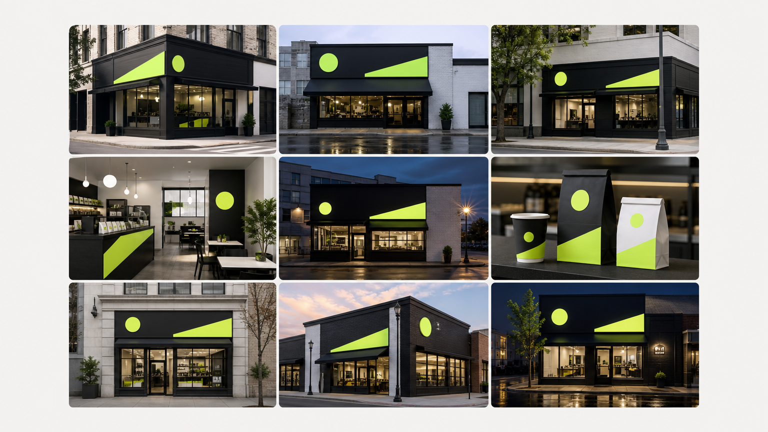
Recognition is not luck. It is a discipline enforced across hundreds or thousands of locations by people who will never meet the founder. That is what a real brand system enables. See how systems get applied in the MAVRK studio portfolio for examples that carry the same identity across packaging, environment, and web.
Brand Consistency Across Locations
Consistency across a franchise footprint requires a brand standards guide with teeth: exact color codes, approved typefaces, spacing rules, photography style, tone of voice, dos and don’ts. Without that document, every new operator improvises, and improvisation is how equity dies. A well-run 90-day brand system locks the standards in before scale exposes them.
The Role of Brand Positioning
Positioning is the one- or two-word space you own in the customer’s head. Chick-fil-A owns “quality service.” Taco Bell owns “bold and irreverent.” Shake Shack owns “elevated basics.” The name of the game is claiming a word before a competitor does. Our CPG branding strategy guide walks through the positioning exercise that has to happen before any visual work begins.
Using Brand Characters and Mascots
Mascots extend recall by giving customers a face to bond with. Ronald McDonald, the Colonel, Jack from Jack in the Box, the Wendy’s redhead. Characters humanize a system that is otherwise industrial. And when chains refresh their identity without abandoning core equity, as Burger King did in its 2021 return to a retro palette, the brand signals modernity without amnesia. According to branding research summarized by Designhill’s analysis of famous logos, the most recognizable fast-food marks use no more than two colors and a single illustrative element. Look at Folkland in the MAVRK case studies for a hospitality identity applying the same restraint.
Common Misconceptions About Fast-Food Branding
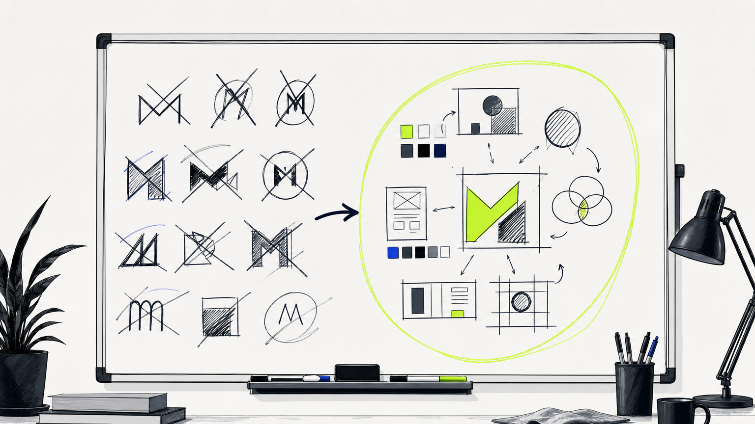
Founders get bad advice. A lot of it. Here are the three we correct most often when clients arrive at MAVRK for a discovery conversation.
Misconception: A Logo Is the Whole Brand
Reality: a logo is one asset inside a system. Without consistent application across signage, packaging, uniforms, digital menus, and social channels, even a beautifully drawn mark fails to build recognition. Our essay on hospitality brand identity makes the case in detail.
Misconception: Branding Is Only for Large Chains
Reality: independent and emerging QSR concepts need intentional branding more than the big chains do, because they cannot ride on decades of built-in familiarity. A three-location burger concept has to earn recognition the hard way, which is exactly why cost-effective marketing strategies for growing brands start with identity, not ad spend.
Misconception: Bold Colors Always Work
Reality: high-contrast neon reads cheap in the wrong context. Several “better burger” and fast-casual brands deliberately use muted, earthy palettes to signal quality over speed. Brand identity is also not a one-and-done project; the best-run chains audit their systems every five to ten years to stay culturally current without losing equity, and small deliberate deviations from category norms, like a distinctive cup shape or unexpected packaging copy, do more for distinction than a full reinvention. See how The Rice Cream uses restraint to stand out in a category that usually screams.
Why Fast-Food Branding Matters for New and Growing Concepts
Branding is not a vanity budget line. It is a lever on unit economics, investor confidence, and marketing efficiency. Skip it and you pay elsewhere.
First Impressions at the Point of Decision
Consumer-behavior studies consistently show that a first impression of a food brand forms within the first seven seconds of exposure. Seven seconds. That leaves no margin for a messy sign, a confused menu board, or a wrapper that photographs poorly on social. A cohesive identity, executed the way our launch program for new brands is designed to deliver it, does the awareness work before any advertising runs.
Branding’s Effect on Perceived Value
Strong branding lets a new concept command a price premium against unbranded or inconsistently branded competitors in the same segment. It also reduces the cost of opening a second, fifth, or fiftieth location, because the brand is already doing the introduction. And for emerging chains chasing capital, investor and franchisee confidence tracks directly with the professionalism of the brand presentation: pitch decks, prototypical store design, packaging systems, everything. See Reali as an example of a brand system built to scale visibly.
How to Get Started with Fast-Food Restaurant Branding
Strategy first, design second. Every good identity we have shipped began with a conversation, not a Figma file. Founders who connect with our team usually start here.
Defining Your Brand Before Designing It
Brand strategy precedes visual design. Target customer, competitive positioning, brand voice, story, and the promise you are willing to defend all get defined before anyone picks a typeface. Our 90-day brand system formalizes that sequence so founders stop skipping steps.
Working with a Branding Partner
Owners who DIY their identity with generic templates usually produce a brand that blends into the category. A branding partner does two things a template cannot: interviews you until the strategy is real, and enforces coherence across deliverables. Our restaurant branding pricing guide sets honest expectations on what that engagement actually costs.
Key Deliverables to Expect
A professional branding engagement for a QSR concept typically delivers a logo suite, color and typography system, packaging templates, brand standards guide, and signage specifications. Some engagements add environmental design, uniforms, digital menu design, and social launch assets. Studios that also handle beverage packaging design can bundle drink lines into the same system, which matters if your concept sells more than food.
Frequently Asked Questions
What is fast-food restaurant branding?
Fast-food restaurant branding is the coordinated identity system, visual, verbal, and environmental, that a QSR concept uses to communicate who it is at speed. It includes logo, palette, packaging, signage, uniforms, tone, and store design.
What colors work best for fast-food branding?
Red and yellow dominate because red triggers urgency and appetite while yellow reads friendly and energetic. Muted earth tones work better for premium fast-casual and better-burger concepts. The right palette depends on your positioning, not category defaults.
How much does it cost to brand a fast-food restaurant?
Costs range widely, from a few thousand dollars for a solo designer to well over fifty thousand for a full identity system with packaging, signage, and standards. Scope, deliverables, and studio experience are the biggest variables in any quote.
What is the difference between branding and a logo for a restaurant?
A logo is one asset. Branding is the entire system that logo lives inside: color, type, voice, packaging, signage, uniforms, environmental graphics, and customer experience cues. The logo identifies you; the branding builds the actual recognition.
How do I brand a new fast-food concept with a small budget?
Prioritize positioning, a strong logo, a defensible palette, and packaging. Skip the deluxe website until unit economics justify it. Templates hurt more than they help; hire a small studio for the strategic foundation, then extend it yourself carefully.
How often should a fast-food restaurant rebrand?
Most successful chains audit their identity every five to ten years and refresh, not replace, the elements that have aged. A full rebrand is rarely needed unless the concept has drifted meaningfully or the equity has genuinely eroded with customers.
What makes a fast-food logo memorable?
Simplicity, scalability, and one distinctive shape. The strongest QSR logos use no more than two colors and a single illustrative element, so the mark reproduces cleanly from a billboard down to a sauce packet without losing character or contrast.
Do independent fast-food restaurants need professional branding?
Yes, more than the big chains do. Independents cannot lean on decades of familiarity, so a coherent brand identity is the fastest way to earn trust, justify a price premium, and support expansion without spending disproportionately on paid awareness.
The Takeaway
Fast-food branding rewards founders who treat identity as infrastructure, not decoration. Get the positioning honest, the system disciplined, and the touchpoints consistent, and the brand does its job before the food does. That is the work MAVRK Studio shows up for: restaurant concepts that want to be recognized in a second, trusted in two, and remembered on the drive home.