

A distinctive restaurant logo is one of the smartest investments a food business can make. It signals cuisine, atmosphere, and price point before a guest even reads the menu. At MAVRK Studio, we build visual identities for restaurant and cafe owners grounded in real strategy, not vibes alone. This guide breaks down what makes a restaurant mark truly unique, walks through examples by category, and hands you a practical framework for briefing your own designer.
What Makes a Restaurant Logo Truly Unique
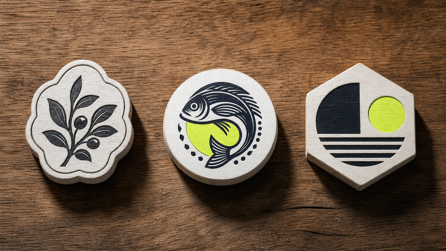
Unique is not a style. It is a decision to reject the templates everyone else pulls from. The best restaurant marks combine a distinctive symbol, purposeful typography, and a palette that fits the food, not the founder’s Pinterest board. That trio is the difference between a logo that owns a corner and one that dissolves into the block. Our team has written before about the psychology of branding for restaurants and why perception starts long before the first bite.
The Core Elements of Logo Differentiation
Three levers do the heavy lifting: a custom mark, considered type, and a tight color story. Warm reds and oranges nudge appetite. Cooler palettes read premium or health-forward. Typography alone can shift a brand from neighborhood diner to tasting-menu territory without changing anything else. For a deeper look at how identity choices shape guest expectation, see our take on brand identity in hospitality and consumer brands.
Common Mistakes That Make Logos Generic
Clip-art forks. Chef hats. Cloche lids. If a stock library sells it, ten restaurants in your metro already use it. Differentiation comes from original illustration, custom lettering, or an unexpected metaphor tied to the concept. Scalability is the practical test: if the mark loses meaning at favicon size or on a takeout cup, it is not finished. Our approach to brand logo design treats those constraints as the brief, not an afterthought.
Restaurant Logo Design Examples by Cuisine and Concept
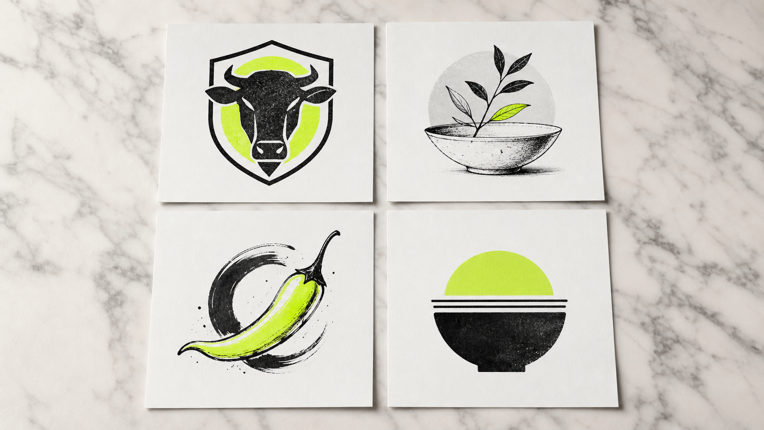
Category shapes expectation. A steakhouse logo carries different weight than a matcha bar. The strongest marks respect that context, then push against it just enough to feel new. Below are four cuisine clusters and the visual moves that tend to work in each. If you are still nailing down the concept itself, our guide on how to open a restaurant covers the positioning work that should happen before any pixel does.
Fine Dining and Upscale Restaurants
Fine dining leans on monograms, crests, and serif wordmarks in restrained palettes: black, gold, ivory, deep navy. Restraint is the message. White space signals confidence. A single well-cut serif does more work than a full illustration ever could. This is the category where legacy typography earns its keep, as our brand transformation notes explore in more depth.
Casual and Fast-Casual Concepts
Fast-casual demands clarity at every size. Shake Shack and Chipotle both use flat color and clean sans-serif wordmarks that hold up on cups, app icons, and highway signage at once. The visual system has to travel from a folded takeout bag to a delivery thumbnail without losing character. See our field notes on creative packaging designs for how these marks translate onto physical goods.
Cafes, Bakeries, and Coffee Shops
Cafes lean hand-drawn, and for good reason. Script lettering and rough illustration signal craft, warmth, and human hands. Coffee drinkers reliably associate that style with trust. The trick is keeping the looseness intentional; sloppy reads as sloppy. Our food truck design guide covers similar terrain for small-footprint concepts where personality has to punch above weight.
Ethnic and Regional Cuisine Restaurants
Regional concepts win when they reference cultural visual traditions without leaning on cliche. Custom illustrated landmarks, textile patterns, or native scripts create distinctiveness that a generic pepper icon never will. Nuance beats shorthand every time. Our piece on multicultural marketing and branding breaks down how to honor a heritage without flattening it. Ghost kitchens live by a different rule: digital legibility first, because the mark lives or dies on a delivery-app tile.
Logo Style Formats: Choosing the Right Type for Your Restaurant
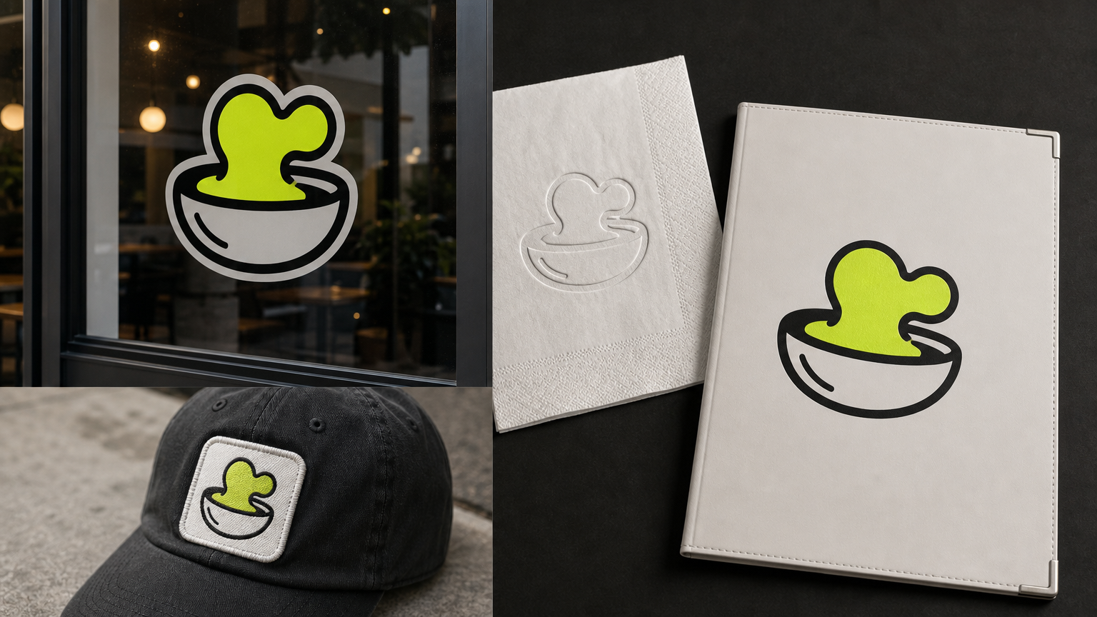
Format follows function. Before picking a style you love, decide where the mark will work hardest: signage, packaging, an app icon, a hat patch. Each format has a natural habitat. Our brand vs marketing strategy explainer is a good primer on why these calls should be made against a strategy, not a mood.
Wordmarks and Lettermarks
Wordmarks work when the name is short, distinctive, and legible small. They ride entirely on typography, which means investing in custom or licensed typefaces so the mark does not read as template. Lettermarks (monograms) do similar work with fewer characters. Great for names that would otherwise crowd a sign, as we discuss in our packaging and brand identity guide.
Emblems and Badges
Emblems own shelf presence. Craft beer halls, BBQ joints, and vintage-leaning diners use them because the enclosed shape carries weight on a T-shirt, a growler, or a trucker hat. Merch potential is a real business driver, and our take on brand promotion through story and strategy touches on how those secondary surfaces build loyalty.
Mascot and Illustrated Logos
Mascots create emotional pull and social shareability. Done well, they carry a brand for decades. Done poorly, they look dated in a season. Family-friendly and fast-food concepts benefit most. If you are exploring how personality travels on social, our notes on social media for food and beverage brands are worth a read.
Combination Marks
Combination marks (icon plus wordmark) are the most versatile format. The icon can stand alone on an app tile while the full lockup lives on the awning. Design platform data suggests the majority of restaurant logo searches filter for emblem or combination styles, which tells you what guests already expect. That flexibility matters for owners juggling signage, menus, packaging, and digital profiles all at once, a challenge covered in our restaurant website optimization guide.
Color, Typography, and Imagery: The Three Pillars of a Memorable Mark
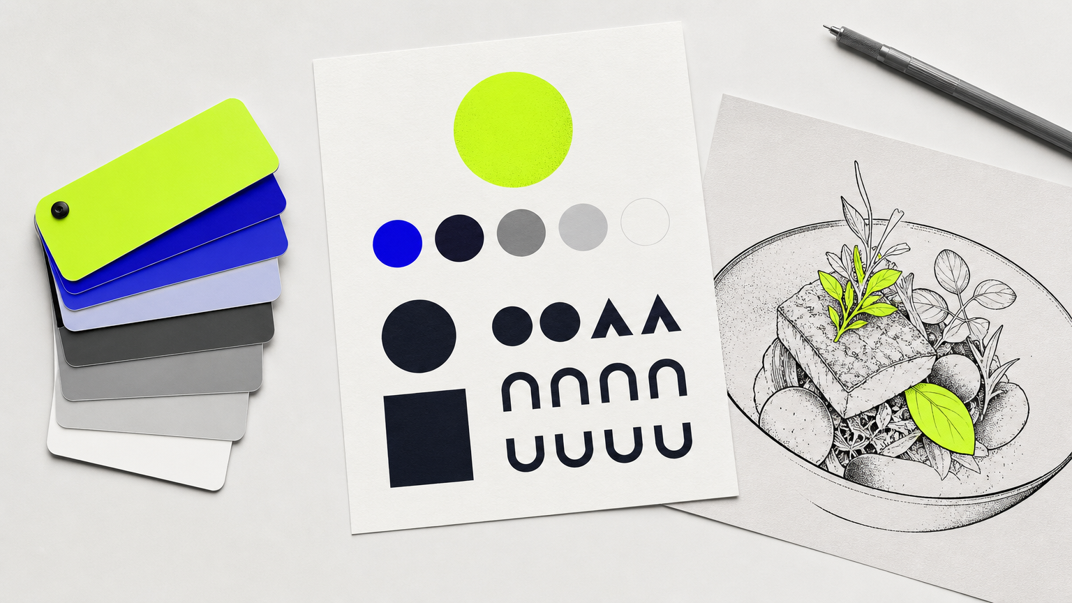
Three pillars carry every good restaurant identity. Get them right and the mark works everywhere. Get them wrong and no amount of polish saves it. Our packaging design mistakes breakdown covers the parallel failures on the shelf side.
Choosing a Color Palette That Reflects Your Concept
Two or three brand colors is the professional standard. More than that and reproduction costs climb, signage gets muddier, and the story blurs. Color theory research summarized by outlets like Harvard Business Review supports the appetite link with warm hues; cooler palettes read premium and clinical. Pick with intent.
Typography Pairing for Restaurant Brands
The hospitality standard is a display serif or script for the wordmark paired with a clean sans-serif for supporting text: menu body, wayfinding, receipts. Character up top, legibility everywhere else. Our cost-effective marketing notes touch on why licensing a strong pair once beats swapping fonts every quarter.
Iconography and Illustration Style
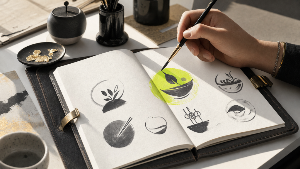
Illustration should match the room. Loose gestural ink suits a neighborhood bistro. Precise geometric icons fit a modern health concept. Test every mark in single-color and black-only versions before signing off, because embossing, stamps, and receipt printers do not care about your gradient. Custom iconography also sidesteps the stock-icon collision, where three businesses on the same street unknowingly share a symbol. Our QR codes on packaging piece covers another surface where single-color reproduction matters more than most owners expect.
How to Brief a Designer for a Unique Restaurant Logo
A weak brief produces weak concepts, then everyone blames the designer. A strong brief sets the shape of the answer before work begins. Our MAVRK Studio work portfolio shows the kind of output that comes out of tight briefs versus loose ones.
Gathering Reference and Defining Your Brand Position
Pull five competitor logos to avoid resembling and five reference logos that feel right, food or not. Feeling matters more than category. Add three to five adjectives that describe the brand personality: rowdy, quiet, precise, sun-bleached. Our guide on jumpstarting your brand on social media is a useful cross-check on how that personality shows up post-launch.
What to Include in a Logo Design Brief
A working brief includes the restaurant name, cuisine type, customer profile, primary application (signage, app icon, menu header), the reference set above, and personality adjectives. Define the primary use case upfront because it shapes proportion, detail level, and file structure. If timing is tight, our restaurant launch playbook walks through the eight-week opening arc and helps you align logo decisions with the broader schedule. For extra context on positioning, see brand builder vs product pusher.
Evaluating Concepts and Providing Feedback
Written feedback that references design principles produces sharper revisions. “The icon feels too heavy relative to the wordmark” beats “I don’t love it.” Confirm file deliverables before signing: SVG, AI, EPS, PNG, and PDF at minimum. Our contact page is the fastest way to talk through what a full deliverable package should include.
Frequently Asked Questions
What makes a restaurant logo stand out from competitors?
Originality in the mark itself, tight typography, and a palette matched to the concept. Avoid stock icons and generic food symbols. A custom illustration or considered wordmark almost always outperforms a template pulled from a logo maker.
How much does it cost to get a unique restaurant logo designed?
Freelance designers typically range from around $500 to $3,000. Boutique studios producing full identity systems run $5,000 to $25,000 or more, depending on scope, research, and application design. Logo makers cost under $100 but rarely produce distinctive results.
Should I use a logo maker or hire a professional designer for my restaurant?
Logo makers work for pop-ups or tests. For any restaurant with a signed lease, hire a professional. A designer builds a system that scales across signage, packaging, and digital surfaces, which template tools cannot replicate at that fidelity.
What file formats do I need for a restaurant logo?
Ask for SVG, AI, EPS, PNG, and PDF versions. Vector files (SVG, AI, EPS) scale infinitely for signage and packaging. PNG covers digital use with transparency. PDF is the universal fallback. Confirm all formats before signing any contract.
How many colors should a restaurant logo have?
Two or three brand colors is the professional standard. More colors increase reproduction cost on signage, packaging, and merchandise. A tight palette also strengthens recognition. Always request a one-color and black-only version for stamps, embossing, and receipt printing.
What is the best logo style for a fine dining restaurant?
Serif wordmarks, monograms, and crest emblems dominate fine dining because they signal formality and legacy. Palettes stay restrained: black, ivory, gold, or deep navy. The restraint itself communicates the price point before any dish arrives at the table.
Can I trademark my restaurant logo?
Yes. In the United States, file with the USPTO once the mark is in use or with intent to use. A registered trademark protects against copycats in your class. Trademark counsel is worth it before you spend on signage.
How long does the restaurant logo design process take?
A professional project typically runs four to eight weeks: discovery, concepts, revisions, and final delivery. Rushed timelines produce weaker work. Build logo development into your opening schedule alongside menu, buildout, and hiring, not as an afterthought two weeks before launch.
Conclusion
A unique restaurant logo is not decoration. It is the shortest sentence your brand ever writes. Get it right and every surface, from awning to app tile, does quiet work on your behalf. Get it wrong and you spend the next five years apologizing for it in every reprint. If you want a partner who treats identity as strategy first and craft second, the team at MAVRK Studio is built for exactly that conversation.