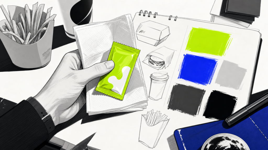


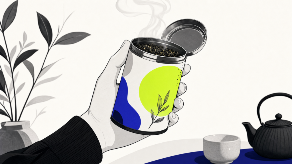
Tea branding is one of the most visually crowded corners of CPG, a category where heritage, ritual, and lifestyle cues all have to land inside a single label. Getting it right means building a coherent identity that ties packaging, typography, color, and voice into one recognizable system. Whether you are launching a boutique loose-leaf line or repositioning a legacy blend, MAVRK Studio helps translate a founder’s vision into a distinct creative direction that reads on shelf and on screen.
What Is Tea Branding
Tea branding is the full visual and verbal identity system for a tea product or company. That includes logo, packaging, typography, color palette, brand voice, and the smaller design decisions that stitch them together. It is not a logo alone. It is the whole system that tells a buyer what your tea is about before they smell a single leaf, which is a discipline we unpack in our broader CPG branding strategy guide.
Defining Tea Branding
Think of tea branding as the ruleset that governs how your product shows up everywhere. Tin, sachet, Instagram tile, cafe menu, wholesale one-sheet. The rules keep the vibe consistent and the recognition compounding. A tight system also protects you when new SKUs, campaigns, or collabs arrive later, which is the throughline in our take on brand identity in hospitality and consumer brands.
Why Tea Branding Differs from Other CPG Categories
Tea carries weight. British afternoon rituals, Japanese matcha ceremonies, Moroccan mint pours, Indian chai stalls. Every design choice reads against that cultural backdrop, so the stakes are higher than a generic snack or beverage launch. Buyers also shop tea on mood and ritual, not just flavor, which is why emotional storytelling drives conversion here more than in most food and beverage categories.
Takeaway: Tea branding is a full system, not a logo, and it competes in a category where cultural fluency matters as much as craft.
Core Elements of a Tea Brand Identity
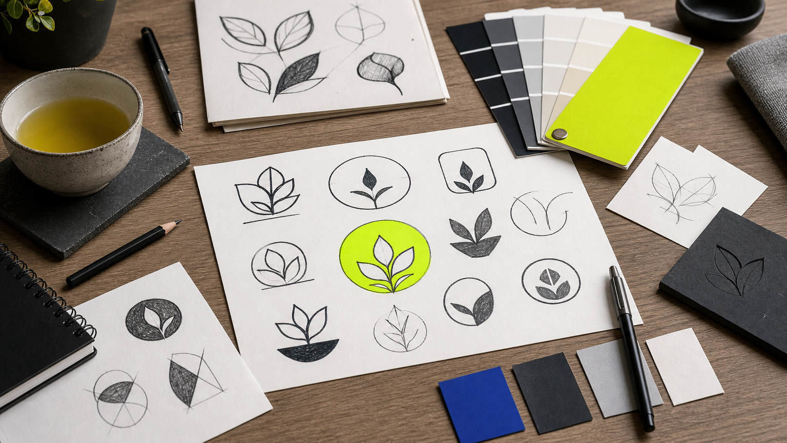
Every strong tea brand is built from the same handful of parts, arranged with intent. Get these right and the rest of the system tends to fall into place, a point we push hard in our piece on packaging and brand identity.
Logo and Wordmark
Tea logos run a wide gauntlet. Minimalist botanical marks for modern wellness. Heritage crests for traditional black tea. Playful lettering for functional blends aimed at Gen Z. The style you pick is a positioning signal before anyone reads a word, which is why we treat mark selection as a strategic decision inside the logo design process.
Color Palette and Typography
Color in tea branding carries direct flavor and mood cues. Greens read fresh and wellness-forward. Deep burgundies push richness and luxury. Earthy neutrals signal artisanal craft. Type does similar work, with serifs reading traditional and authoritative while clean sans-serifs align with modern wellness. Our thinking on the balance between the two lives in this look at the future of branding.
Packaging Design
Packaging structure shapes the physical brand experience. Tins for gift-worthy premium. Sachets for on-the-go convenience. Folding cartons for shelf efficiency. Kraft pouches for artisanal signaling. Whatever you pick has to perform on physical shelves and as a 400-pixel e-commerce thumbnail, a tension we cover in our roundup of creative packaging designs.
Takeaway: Logo, color, type, and structure work as a system. Consistent pattern and iconography across a line keeps that system legible as you scale SKUs.
How to Define Your Tea Brand Strategy
Design without strategy is decoration. Before any moodboard opens, you need clarity on who you are for, where you sit in the market, and what you sound like. That order matters, and it is the same discipline we apply in our framing of brand versus marketing strategy.
Identifying Your Target Audience
Skip the demographic slop. Real audience definition includes lifestyle, purchasing motivation, and ritual context. Is your buyer looking for daily comfort, a wellness boost, a gift, or a status object? Each answer sends you toward a different visual world, and each one has implications for how you show up in social channels for CPG brands.
Positioning Your Tea Brand in the Market
Pick a lane. Luxury and gifting. Everyday wellness. Cultural heritage. Functional health. Specialty single-origin. Trying to be all of them at once is how tea brands end up invisible. Positioning is also what separates brand builders from product pushers, and tea is a category where the builder wins over time.
Developing a Brand Voice and Narrative
Origin, sourcing, and craft are the raw material of tea storytelling. Consumers increasingly use those cues to justify premium pricing, and they can smell a fabricated backstory from a mile away. Voice, whether warm and intimate or authoritative and educational, has to hold across packaging copy, email, and social, which is why we treat it as a load-bearing part of multicultural brand work.
Takeaway: Audience, positioning, and voice come before typography. Skip that order and you will redesign everything twice.
Tea Packaging Design: Trends and Best Practices
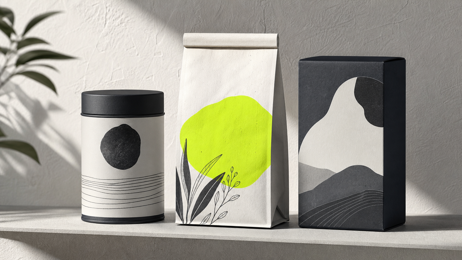
Tea packaging is where strategy becomes tangible. It is also where most founders overspend and under-plan, a pattern we lay out in our breakdown of packaging design mistakes for food and beverage brands.
Design Trends Shaping the Tea Category
A few currents worth naming:
- Botanical illustration. Still dominant in premium tea, lending provenance and craft.
- Minimalist wellness. Clean layouts, restrained color, uncoated stocks. Big with younger buyers.
- Sustainability as message. Recyclable and compostable materials get pushed to the front of pack because they influence purchase.
- Bold color blocking. Loud, flavor-coded palettes are winning in the functional and iced-tea aisles.
These currents get sharper context in our recap of trends from the Summer Fancy Food Show, where tea packaging always shows up in force.
Balancing Shelf Impact with Brand Cohesion
Shelf impact needs contrast and hierarchy so a product is legible at a glance. Consistent design architecture across a line, shared structural elements with variable color for flavor cues, helps buyers navigate while reinforcing brand unity. The same logic scales to e-commerce, which we cover in our e-commerce website must-haves.
Takeaway: Pick a design architecture first, then vary color or illustration per SKU. Reversing that order fragments the line.
Common Tea Branding Mistakes to Avoid
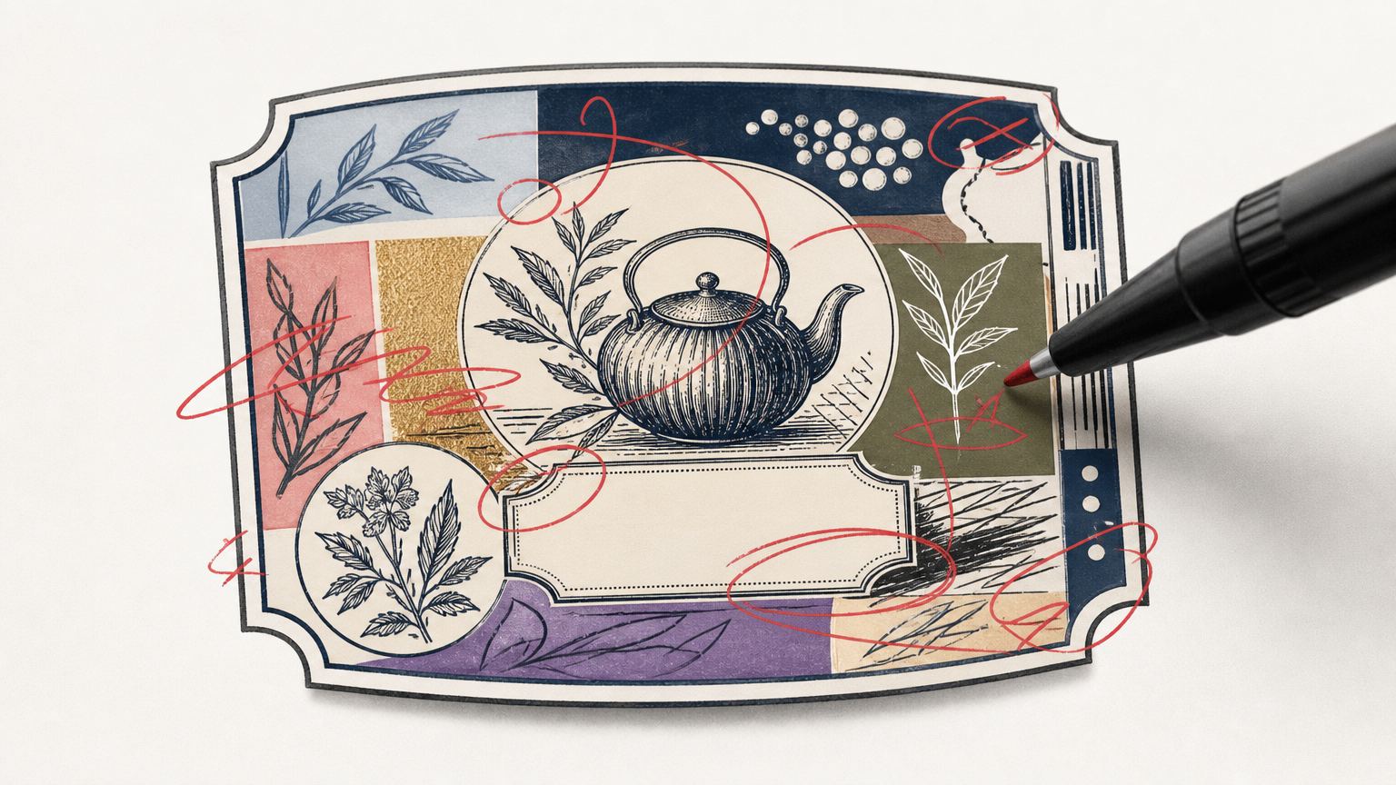
Tea is a category with well-worn traps. Falling into any of them is expensive and slow to fix.
Generic Visual Identities
A generic teapot silhouette or a tossed-off leaf icon gives you visual parity with hundreds of competitors. That is not a brand, that is wallpaper. Distinctive marks require real strategic input, which is the whole point of hiring a category-literate studio, a case we make in our guide to choosing a creative agency as a startup.
Inconsistent Brand Application
Inconsistent application across packaging formats, digital channels, and marketing collateral dilutes recognition and signals low production value. Founders often notice the drift after it has already cost them, which is why documented brand guidelines matter, and why we build them into every engagement referenced in our brand transformation writeups.
Ignoring Cultural Context
Tea has deep cultural roots across many traditions. Careless references, mistranslations, or aesthetic borrowing without understanding can misrepresent origins and alienate the exact buyers you want. Cultural fluency is not optional in this category, a theme we return to in our multicultural marketing work and worth studying in published brand standards like those from the Texas Education Agency as a reminder that guidelines are the connective tissue of any serious brand.
Takeaway: Distinctive marks, documented guidelines, and cultural respect are the three lowest-cost fixes with the highest payoff.
Building a Tea Brand Step by Step
Here is the sequence a well-run tea brand build actually follows, in the order the work happens.
- Discovery. Stakeholder interviews, competitor audit, audience research.
- Strategy. Positioning, voice, narrative, name if needed.
- Identity design. Logo, color, type, pattern, iconography.
- Packaging system. Structure, hierarchy, SKU architecture.
- Guidelines. Documented rules so the brand holds under pressure.
- Rollout. Primary packaging and e-commerce first, secondary materials next.
Discovery and Strategy Phase
Discovery informs every downstream design decision and cuts revisions later. Founders who skip it usually pay for it in a second identity project 18 months out. We cover why this phase pays back in our piece on cost-effective marketing strategies.
Design and Identity Development
Identity development moves from concept exploration through refinement to a finalized system, documented in brand guidelines. That deliverable is what lets you scale into new SKUs, campaigns, or channels like TikTok Shop for CPG without the visual system falling apart.
Launch and Brand Rollout
A phased rollout prioritizes highest-visibility touchpoints. Primary packaging and e-commerce first. Wholesale sell sheets, trade booths, and secondary marketing next. Post-launch brand audits at six to twelve months catch drift early. If you are still assembling the raise before rollout, our pitch deck guide for consumer brands covers how identity work should show up in the deck itself.
Takeaway: Discovery, design, guidelines, phased rollout, audit. Follow that order and you buy yourself years of runway before a rebrand is necessary.
Frequently Asked Questions
What makes a tea brand successful?
Successful tea brands pair a clear positioning lane with a distinctive visual system and consistent voice. They earn premium pricing through credible origin stories, resonate emotionally with a specific buyer, and hold their identity together across packaging, digital, and retail touchpoints.
How much does tea branding and packaging design cost?
Costs vary widely by scope. A boutique identity plus a small SKU packaging system typically starts in the mid five figures with an experienced studio, while full-line CPG programs can run six figures. Freelance-only assembly is cheaper up front, more expensive in revisions.
What should a tea brand logo include?
A tea brand logo should include a distinctive mark, a legible wordmark, and clear usage rules across scales and backgrounds. Avoid generic teapots and leaf icons. The mark should signal positioning, whether premium heritage, modern wellness, or functional benefit.
How do I choose colors for my tea brand?
Choose colors based on positioning and flavor cues rather than personal preference. Greens read fresh and wellness. Burgundies read rich and luxurious. Earthy neutrals read craft. Test palettes at thumbnail scale so they survive the e-commerce grid, not just the moodboard.
What is the difference between a logo and a full tea brand identity?
A logo is a single mark. A brand identity is the full system, including logo, typography, color, packaging architecture, voice, and usage rules. Identity is what makes a tea line recognizable across dozens of touchpoints, not just one.
How important is packaging design for selling tea online?
Very important. E-commerce buyers scan tiny thumbnails before reading a single word, so hierarchy, color, and flavor cues have to land at 400 pixels. Weak packaging design directly reduces click-through and conversion in category listings and paid ads.
Should I hire a brand designer or design my own tea packaging?
Hire a specialist studio if you plan to scale into retail, raise capital, or expand SKUs. DIY is fine for a farmers-market test, risky for anything beyond that. Category knowledge and a structured process pay back quickly against wasted print runs.
How long does it take to develop a tea brand identity?
A focused tea brand identity project typically runs eight to sixteen weeks, depending on scope, number of SKUs, and packaging complexity. Discovery adds two to three weeks. Adding retail-ready packaging production and dielines can push the timeline to five or six months.
Conclusion
Tea branding rewards founders who treat identity as a system, not a decoration. Get the strategy right, then let logo, color, type, and packaging build a world that a specific buyer wants to live inside. Sustain it with documented guidelines and periodic audits. If you are ready to build something that actually stands out in the aisle, MAVRK Studio partners with hospitality and consumer founders to translate positioning into work that holds up on shelf, online, and in the wild.