


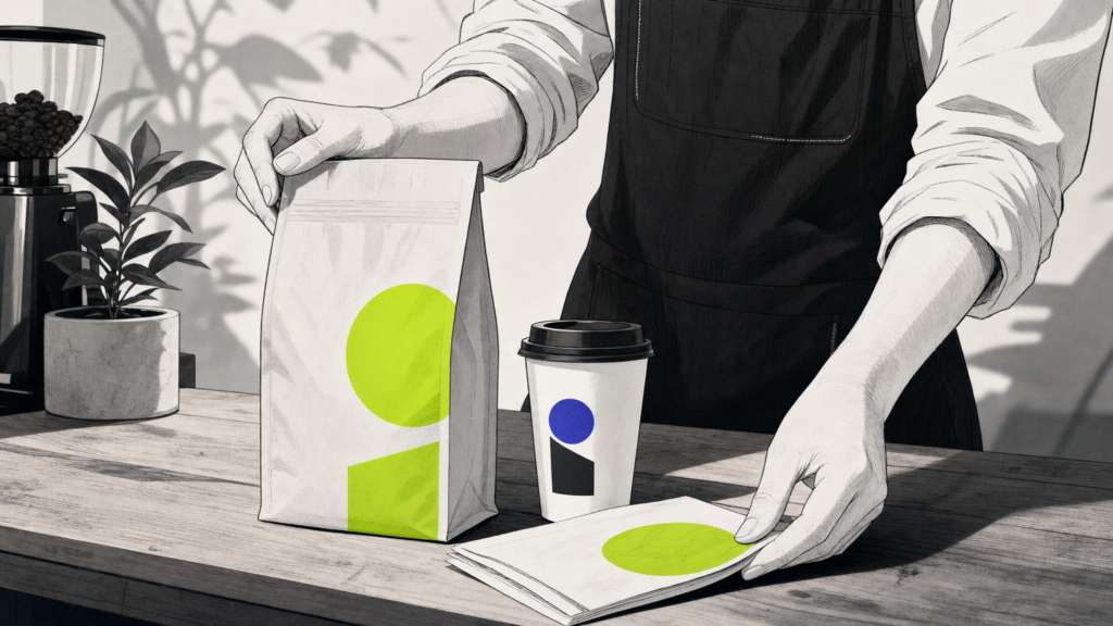
Coffee branding is the practice of building a distinct identity for a coffee business through visual design, messaging, packaging, and customer experience. In a market where thousands of roasters, cafés, and retailers chase the same cup, a well-crafted brand is often the difference between a loyal following and an empty shelf. MAVRK Studio helps hospitality and consumer founders define identities that resonate with the right audience from the first pour.
What Is Coffee Branding
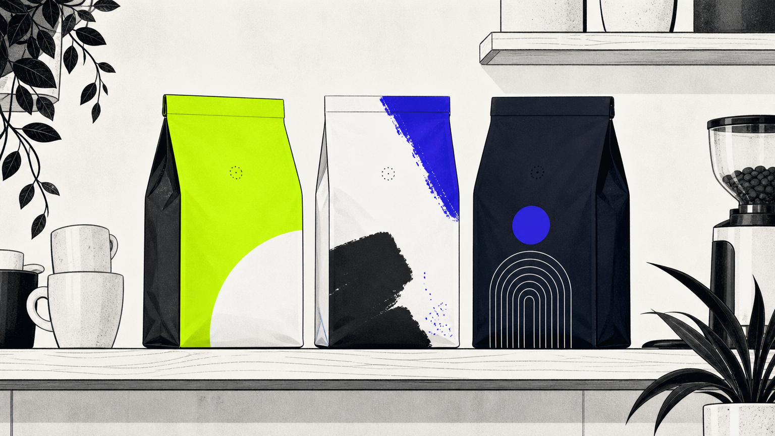
Coffee branding is the sum of every touchpoint a customer meets: logo, packaging, color palette, typography, café interior, social media presence, and tone of voice. It is not the bag. It is not the sign. It is the compounding effect of all of them, working in the same key. A strong brand system pulls a roaster out of the commodity aisle and into memory, which is where loyalty actually lives. Our guide to brand identity in hospitality and consumer brands breaks the mechanics down further.
A precise definition
According to Roast Magazine, branding differentiates one roaster from another and remains a defining aspect of a company’s identity, not just its logo. It is worth separating two ideas that often blur: brand identity is what a business projects outward through design and language, while brand image is what customers actually perceive and repeat back. The gap between those two is where most coffee brands quietly lose ground, and where deliberate logo and identity design work earns its keep.
In plain English
If someone can describe your coffee brand to a friend without pointing at your bag, your branding is doing its job. That is the whole test, and it is the same principle we apply across every brand transformation engagement.
The History and Evolution of Coffee Branding
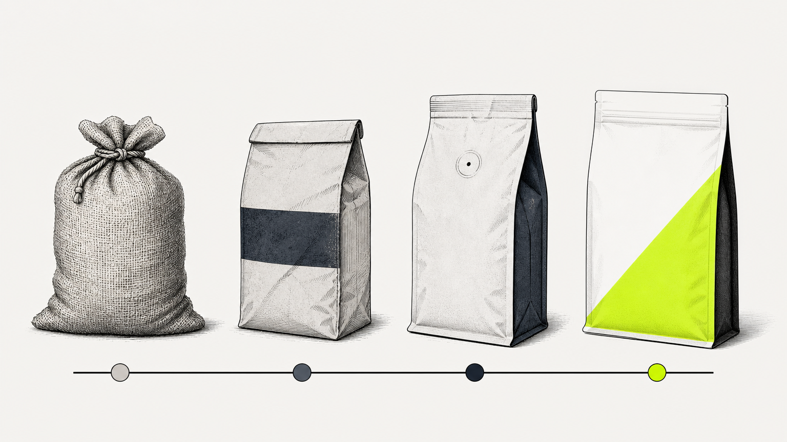
Coffee branding did not exist for most of coffee’s commercial history. It arrived with industry, then evolved in waves that each rewrote the visual and verbal rules. Understanding the arc helps founders place themselves inside it, and helps designers avoid recycling references from a wave that is already over. Our look at where branding is heading picks up where this history ends.
First-wave and second-wave branding
Through the early 19th century, green coffee was sold in barrels at the general store and roasted at home, alongside flour and sugar. Branding was not possible until industrial roasting was possible. Per Roast Magazine, Jabez Burns’s roaster made large-scale production feasible, and Arbuckles’ Coffee ran with it after the Civil War, printing name, imagery, and coupons on paper bags and creating the first widely recognized coffee brand in the United States. By the early 20th century, Hills Brothers, Folgers, and Maxwell House had shifted American habits from home-roasted to packaged roasted, each with distinct brand marks. Those same packaging fundamentals still apply today.
Third-wave and the craft era
The third-wave movement of the late 2000s and early 2010s elevated coffee to a gourmet product. Flavor notes, provenance, and sustainability became core storytelling components, according to BP&O. Design followed the shift: heritage marks gave way to editorial systems, custom typefaces, and packaging that read more like a specialty grocery product than a supermarket staple. This is the era that trained an entire generation of consumers to expect considered packaging design as table stakes.
Fourth-wave and what comes next
A fourth-wave now emphasizes gamified, science-infused experience and deeper supply-chain transparency, opening fresh visual and narrative territory. Expect more motion-first identities, more data on the bag, and more brands treating the barista bar as a lab. Founders planning ahead should read our take on future branding trends before locking in a look that will feel dated in two years.
Core Elements of a Strong Coffee Brand Identity
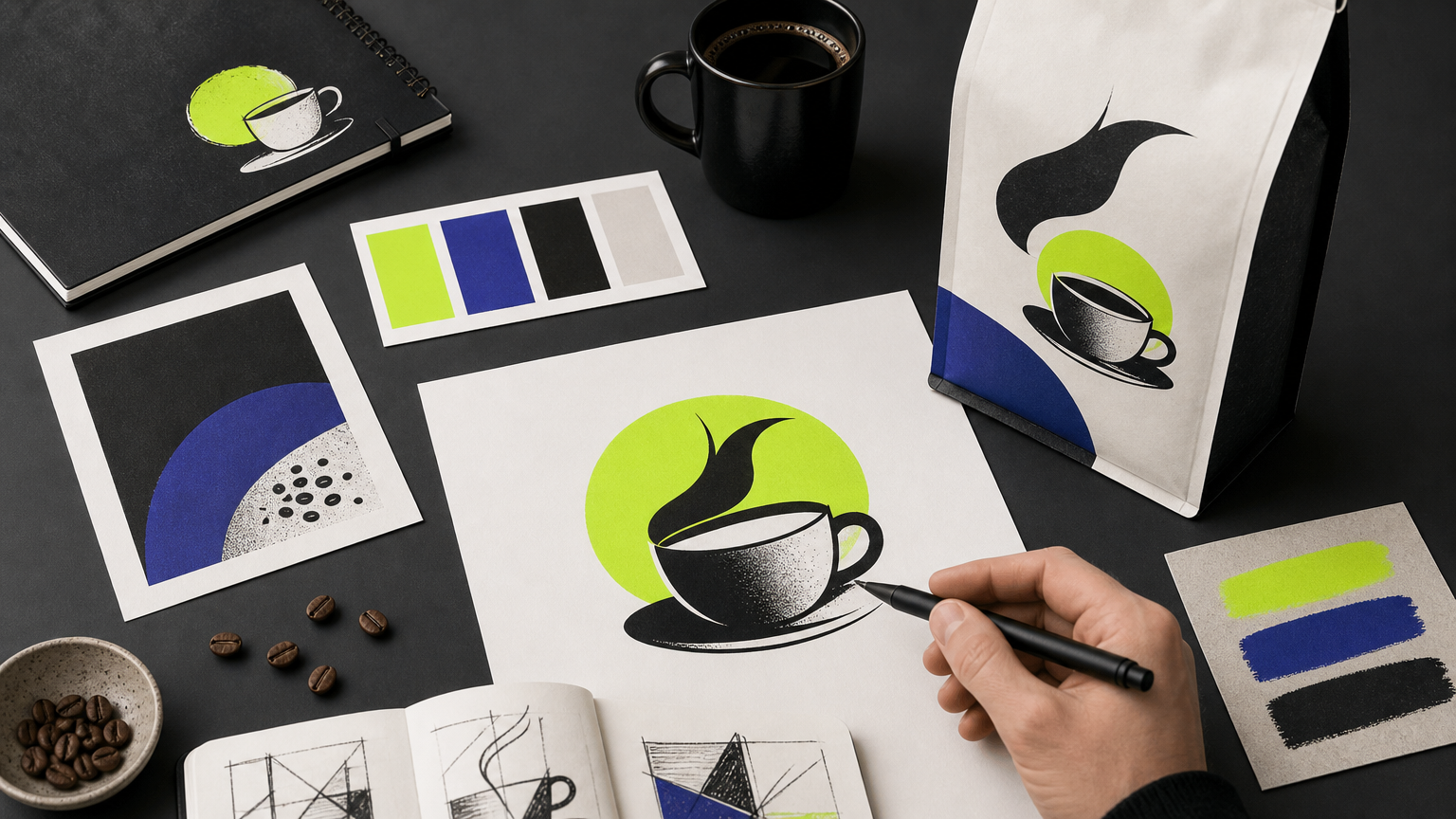
A coffee brand identity is a system, not a mood board. Each element carries a job, and the jobs have to line up. When they do, the shelf stops feeling crowded. Our creative packaging work shows how each layer stacks in practice.
Logo and wordmark
A logo carries recognition; a wordmark carries voice. Fieldwork Facility adopted an ellipsis as the Intermission logo to embody the brand’s core theme of “time,” proving how a single symbolic device can unify an entire identity system. B&B Studio’s Mozzo wordmark uses an extended “Z” as both a frame for copy and a hook for animation, per The Brand Identity. Read our primer on designing a brand logo for the process behind decisions like these.
Color palette and typography
B&B Studio’s Mozzo revamp used an unconventional orange and mint green palette, deliberately avoiding typical Italian heritage cues to signal an ethical challenger position. Typography choices must match: Mozzo pairs its dynamic wordmark with bold, contemporary type to amplify a purposeful, direct voice. Color and type are the two fastest ways to signal category or break from it, which is why we treat them as strategic decisions inside every brand identity build.
Packaging design
Kaffein in Singapore commissioned original artworks from artists including Japan’s Haruka Yamamura for each product, treating packaging as gallery-style art under the concept “The Art of Coffee.” Packaging is the highest-use surface a coffee brand owns, and the fastest place to lose credibility. Skim our packaging design mistakes for food and beverage brands before signing off a print run.
Brand voice and messaging
Voice is the written tone across menus, social posts, and packaging copy. It builds emotional recognition the same way color builds visual recognition. A brand that sounds like everyone else on Instagram sounds like nobody. Our social playbook for food and beverage brands covers how to hold a voice consistent across formats.
Takeaway: treat logo, color, type, packaging, and voice as one system. Skip any layer and the recognition math stops compounding.
How to Build a Coffee Brand From Scratch
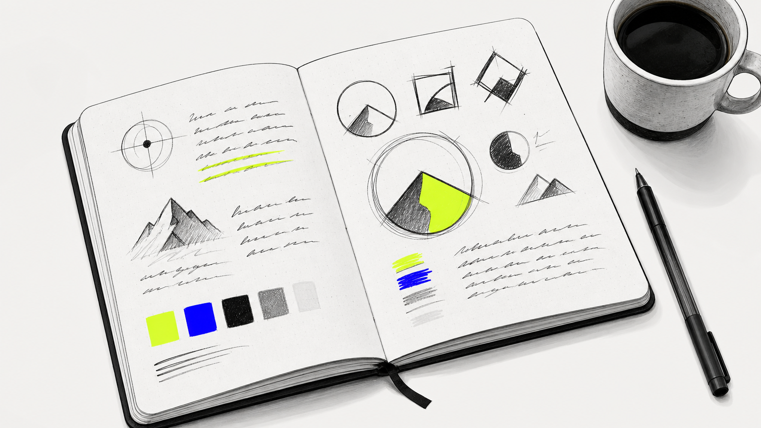
There is a sensible order to this work. Skipping steps is what produces the identity that looks fine on a bag and falls apart on a menu, a sign, and a delivery van. Founders launching new concepts can pair this with our restaurant opening guide for the operational side.
Define your brand positioning
Positioning starts with three answers: who is your customer, what do you stand for, and what makes your product different from the roaster on the next shelf. A brand platform, including tagline, mission, and values, should precede any visual work, since core values clarify why the business exists and what makes its coffee distinct. Buyer personas help identify the target customers your brand should speak to. Understanding competitors and checking the shelf can sharpen positioning and reveal gaps in the market. Mozzo’s “Coffee. Community. Connection.” drove every design decision that followed. For a broader framework, see our CPG branding strategy guide.
Develop your visual identity
Visual identity must be designed with every application in mind from the start, including digital animation. B&B Studio drew Mozzo’s extended-Z wordmark specifically for motion contexts, which means it survives the jump from bag to Reel without losing character. Our brand vs marketing strategy piece explains why front-loading identity work saves budget later.
Apply the identity across touchpoints
Touchpoints to brand include packaging, cups, bags, signage, staff uniforms, social templates, and the physical café itself. Consistency across all of them is what builds recognition. Specialty roasters should also treat origin storytelling, specific farms, regions, and processing methods, as a differentiation lever on packaging. If a mobile format is part of the plan, our food truck design guide covers how identity translates to a rolling touchpoint.
Common Misconceptions About Coffee Branding
Three ideas keep costing coffee founders money. Naming them plainly is the fastest way to avoid them, and it lines up with what we see across brand builder versus product pusher engagements.
Misconception: Branding is just the logo
A logo is one component of a system. Without consistent color, type, packaging, and voice around it, even a strong logo will not build recognition at scale. Our logo design process breakdown shows where the mark sits inside the wider identity.
Misconception: Premade templates are sufficient for growth
Template identities skip the strategic differentiation needed to stand out in a saturated market. Premium shelf placement and wholesale accounts typically require a custom, cohesive system, which is exactly the case we make in choosing creative agencies for startups.
Misconception: Great coffee sells itself
Quality is necessary but not sufficient. Arbuckles’ success came from pairing quality roasted coffee with a recognizable branded package, not from the coffee alone. Rebranding, meanwhile, is not a failure signal: Mecca Coffee commissioned a full identity evolution at the 20-year mark, per BP&O, to reflect its growth. Our brand transformation notes walk through when and how to make that call.
Related Concepts in Coffee Branding
A handful of adjacent terms come up in almost every founder conversation. Short definitions, so the vocabulary lands cleanly. These map to the broader packaging and brand identity practice.
Brand equity
Brand equity is the commercial value a brand name adds beyond the product itself. High equity supports premium pricing, stronger retailer terms, and repeat purchase. Our cost-effective marketing strategies for brands touches on how equity compounds.
Private label coffee branding
Retailers and foodservice operators can sell coffee under their own brand name, which requires a complete identity system distinct from the roaster’s own marks. The mechanics resemble those we cover in the CPG branding strategy guide.
Sustainability and ethical branding
Sustainability positioning is now a baseline expectation in specialty coffee. Brands like Intermission build it into the core identity rather than bolting it on as a marketing add. See our notes on food and beverage social media for how to communicate that credibly without greenwashing.
Brand guidelines
Brand guidelines document logo usage, color codes, type hierarchy, and tone rules. They are what let a dozen designers, printers, and platforms produce work that still looks like the same brand. Founders often underestimate this layer, which is one of the mistakes we flag on packaging projects
Frequently Asked Questions
What makes a good coffee brands identity?
A good coffee brand identity is coherent across every touchpoint, distinct from category conventions, and specific enough that customers can describe it without pointing at the bag. It combines clear positioning, considered visuals, and a consistent voice.
How much does it cost to brand a coffee company?
Costs vary widely by scope. A basic logo package can run a few thousand dollars, while a full identity system with packaging, guidelines, and touchpoint design typically ranges from mid five figures to six figures, depending on complexity and rollout.
What colors work best for coffee branding?
There is no universal answer. Browns and creams telegraph heritage, while unexpected palettes like Mozzo’s orange and mint signal challenger positioning. The right palette follows from brand strategy, not from category defaults or current design trends.
How do I name my coffee brand?
Start from positioning: what you stand for, who you serve, and what makes you different. Test candidates for trademark availability, domain access, phonetic clarity, and how they feel spoken aloud in a café setting before committing to any option.
What is the difference between a coffee brand and a coffee label?
A label is the printed artifact on a bag or bottle. A brand is the full identity system, including logo, voice, packaging, and experience. The label communicates the brand; it does not replace it or define it on its own.
How important is packaging in coffee branding?
Packaging is often the highest-use surface a coffee brand owns. It is the shelf-level pitch, the unboxing moment, and the daily reminder in a customer’s kitchen. Weak packaging undermines strong coffee; strong packaging amplifies it.
How do I rebrand an existing coffee business?
Start with an audit of current perception versus intended positioning. Evolve rather than erase where equity exists, as Mecca Coffee did at 20 years. Rebuild the identity system in full, then roll out across packaging, signage, and digital in a coordinated sequence.
What is third-wave coffee branding?
Third-wave branding emerged in the late 2000s and early 2010s, treating coffee as a gourmet product. It emphasizes flavor notes, provenance, and sustainability, and typically uses editorial design, custom type, and minimal packaging over heritage cues.
Conclusion
A coffee brand is built in layers, and the layers only compound when they share a strategy. Get the positioning right, then the visuals, then the voice, then the discipline to hold all three across every touchpoint. That is the difference between a bag that sells and a bag that sits. MAVRK Studio partners with roasters, cafés, and consumer founders to build identities that earn shelf, staff, and repeat orders.