

Japanese restaurant branding draws on a deep visual culture, from the restrained elegance of wabi-sabi to the bold geometry of traditional hanko stamps. Getting the identity right means balancing authenticity with commercial appeal. MAVRK Studio helps restaurant owners translate that balance into logos, menus, and environments that attract guests and hold their loyalty long after the first visit.
What Japanese Restaurant Branding Actually Means
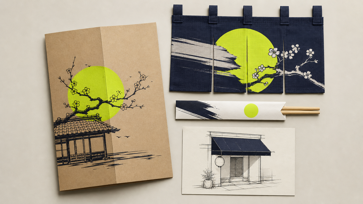
Japanese restaurant branding is not a logo. It is every visual and experiential touchpoint a guest sees, touches, or photographs: the mark on the awning, the weight of the menu paper, the color of the noren curtain, the sleeve on the takeout chopsticks. A serious identity operates as one coherent system across all of them, which is exactly the discipline covered in our guide to how restaurant branding agencies build profitable brands.
Underneath the surface, the good ones borrow from real Japanese design principles: ma (the intentional use of negative space), wabi-sabi (finding beauty in imperfection), and mono no aware (a quiet awareness of transience). These are not decorations. They shape spacing, proportion, and rhythm across the entire brand identity system.
Definition: Identity Beyond the Logo
A brand identity is the full toolkit that lets a restaurant look and feel like itself in every context, from Instagram grid to hand-stamped kraft box. It includes the primary mark, secondary marks, typography, palette, patterns, photography direction, and voice. The logo is one artifact inside that system, not the system itself.
In Plain English
If a guest could recognize your restaurant from a matchbook, a napkin, or a delivery bag with the label torn off, you have a brand. If they cannot, you have a logo. Coherent identity increases perceived quality and justifies premium pricing, which matters most when diners are choosing between a fast-casual chain and an omakase counter that charges four times more. It also forces specificity: an izakaya, a ramen shop, a sushi bar, and a teppanyaki room should not share the same generic “Japanese” aesthetic, and smart positioning work makes that difference legible.
Core Visual Principles That Drive Japanese Branding
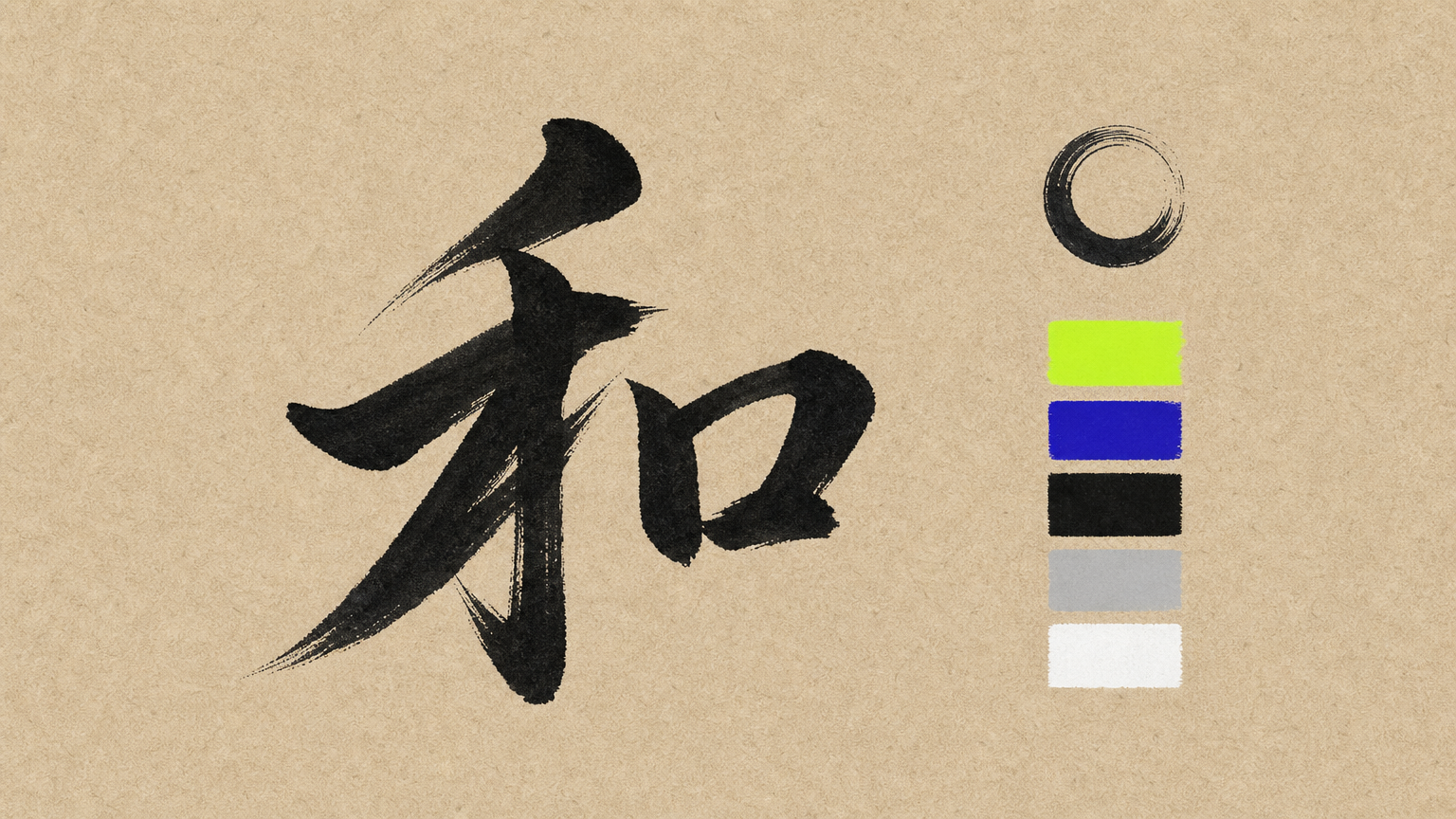
Three technical pillars carry most of the weight: minimalism, typography, and color. Get these right and the culturally specific details land. Get them wrong and no amount of seigaiha pattern will save the identity, which is why seasoned food and beverage brand work treats them as non-negotiable foundations.
Minimalism and Negative Space
Sparse layouts are functional. They push the eye toward food photography, menu hierarchy, and the brand mark without competing noise. Every element on a page has to earn its place, and the proportional relationship between empty and filled space needs expert calibration. Restraint is a craft, not a shortcut, and it shows up across every brand touchpoint a guest encounters.
Typography: Kanji, Katakana, and Latin Pairings
Typography pairing is the most technically demanding decision in this category. Combining a Japanese script with a Latin typeface requires optical balancing so neither dominates the composition or breaks readability at small sizes. Stroke weight, x-height, and vertical rhythm all have to reconcile, and the same rules extend to menu design and print applications.
Color Palettes That Signal Authenticity
Effective Japanese restaurant palettes cluster around three archetypes:
- Deep navy and white: precision, ocean, sushi-grade fish. Common in high-end sushi counters.
- Muted earth tones with matcha green: warmth, organic ingredients, izakaya intimacy.
- High-contrast black and red: drama, premium energy, fine-dining theater.
Traditional motifs like seigaiha (wave scales), asanoha (hemp leaf), and sashiko stitching add cultural depth when they are used purposefully. Rising-sun flags, cherry blossoms, and torii gates are the shortcuts that read as generic. As World Brand Design Society noted in their Koboru Sushi feature, the strongest minimalist food branding earns its authenticity through restraint and specificity, not stock cultural imagery. Diners with a trained eye notice the difference immediately, and it costs bookings, so invest in a considered visual system instead.
How It Works: Building a Japanese Restaurant Brand from Scratch
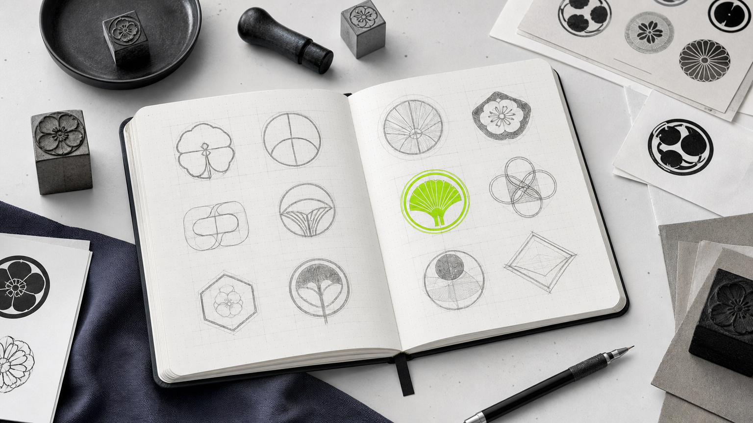
The process is linear and unforgiving. Skip the strategic front end and you spend the rest of the project papering over an unclear position. Follow the same sequence used across serious hospitality brand builds and the design decisions get much faster.
Discovery and Concept Development
Discovery names the price point, the cuisine sub-category, the target demographic, and the competitive set. These four inputs drive every design decision downstream. Get them wrong and the whole identity drifts. This is the phase where a positioning brief lives or dies, and it belongs on paper before anyone opens a design file.
Visual Identity System Creation
A complete system usually includes:
- A primary logo
- A secondary mark, often a mon-style crest or hanko-inspired stamp
- Two or three brand typefaces (one Japanese, one Latin display, one Latin text)
- A defined color palette with print and digital specifications
- A pattern or texture library
- Photography and illustration direction
Built together, these components can flex from a business card to a building facade without breaking, which is the whole point of treating identity as a scalable system.
Applying the Brand Across Touchpoints
Menu design is the highest-frequency brand touchpoint most restaurants own. Layout grid, paper stock, illustration style, and language formatting (romanized Japanese versus English translation) either reinforce the identity or quietly undermine it every service. Packaging is close behind, and branded takeout systems turn a soy sauce vessel, a chopstick sleeve, or a kraft box with a hand-stamped mon into an at-home extension of the restaurant. Environmental design (wall treatments, staff uniforms, tableware) completes what delivery competitors cannot replicate.
Why Authentic Japanese Branding Matters for Business Outcomes
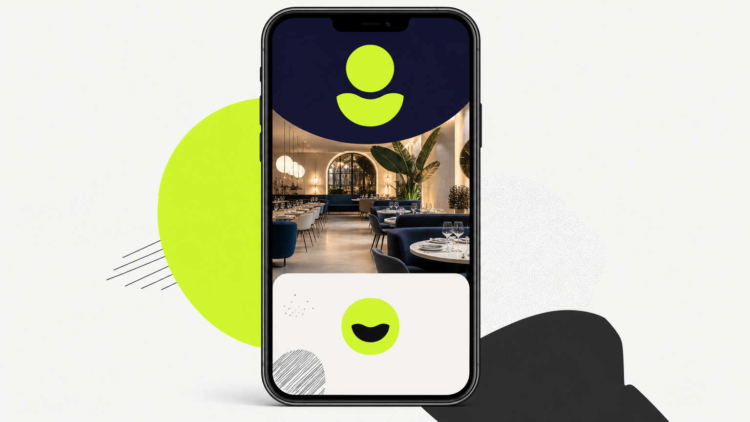
Guests cross-reference a restaurant’s visual identity against their expectation of food quality before they book. A weak brand suppresses reservations even when the kitchen is excellent, which is a solvable problem with a proper hospitality identity investment.
Credibility With Discerning Diners
Perceived authenticity is a defensible market position. Independent Japanese restaurants cannot beat chains on price, so the brand has to carry the quality signal. When the identity communicates specificity, care, and knowledge, guests grant the restaurant the benefit of the doubt on the tasting menu before the first course lands. That premium is real revenue, and it protects margin against aggressive chain competitors.
Social Media Shareability and Visual Consistency
Consistent visual identity across Instagram, Google Business Profile, and print menus compounds recognition into repeat visits and word-of-mouth. Restaurants with a clearly defined aesthetic also generate significantly more user-created content, because guests photograph environments and plating that feel intentional. That is free reach, and it rewards restaurants that treat social channels as an extension of the brand system rather than an afterthought.
Common Misconceptions About Japanese Restaurant Branding
Three misreads keep showing up in early-stage briefs. Each one costs money.
Misconception: Minimalism Means Low Effort / Reality: Restraint Requires Precision
Minimalist design is harder than maximalist design, not easier. Every element has to justify its presence and every proportional relationship between negative and positive space has to be deliberate. Cheap minimalism looks empty. Expensive minimalism looks inevitable, which is exactly what experienced identity work delivers.
Misconception: Generic Japanese Motifs Are Safe / Reality: They Signal Generic Quality
Torii gates, koi fish, Mt. Fuji, and brushstroke swooshes read as clip-art shorthand. They undermine the premium positioning most Japanese restaurants are trying to build. A single considered mon or an original pattern beats a stock library every time, and restaurant-specific design experience is what tells the difference.
Misconception: Branding Is Only for Large Restaurants / Reality: Independent Venues Benefit Most
Independent Japanese restaurants benefit disproportionately from a strong identity because they have no chain recognition to fall back on. The brand is the primary quality signal a first-time diner sees. A well-built system also scales from one location to several without a full redesign, which makes the upfront investment economically rational, as restaurant branding pricing benchmarks make clear.
How to Get Started With Your Japanese Restaurant Brand
Two moves before you talk to any designer.
Define Your Restaurant’s Specific Concept Before Design Begins
Write a one-paragraph positioning statement. Name the cuisine sub-type (edomae sushi, Osaka-style izakaya, Sapporo ramen), the price tier, the target guest, and two or three adjectives that describe the feel of the room. That brief steers every subsequent decision, and it looks a lot like the operational planning behind opening a restaurant well.
Then audit the competitors in your city. Note the visual patterns that are oversaturated locally (brushstroke logos, red-circle flags, generic wave patterns) so your identity avoids that territory. Reddit design communities routinely flag these same shortcuts in live critiques of Japanese restaurant identity work, which is a useful reality check.
Choosing the Right Branding Partner
A partner with restaurant-specific experience understands menu production, signage fabrication, and packaging print realities. These are skills general graphic designers do not have. Ask to see full identity system work, not just logos, and confirm the partner has taken a brand from print to digital to environmental application. That range is what separates a moodboard from a working brand system that survives contact with a kitchen.
Frequently Asked Questions
What makes a Japanese restaurant logo look authentic rather than generic?
Authentic logos borrow the structural logic of hanko stamps or family mon crests, use restrained typography, and avoid stock cultural imagery. They feel specific to the concept, not to a generic Japan. Craft and proportion beat decoration.
How much does Japanese restaurant branding typically cost?
Complete identity systems for independent Japanese restaurants generally range from $15,000 to $60,000 depending on scope, deliverables, and studio tier. Menu, packaging, and environmental design add cost. See current restaurant branding pricing benchmarks for a fuller breakdown.
Should a Japanese restaurant use Japanese script in its logo?
Often yes, but only when set correctly. Kanji or katakana adds authenticity when paired with the right Latin type and balanced optically. Poorly set Japanese type reads as decoration to bilingual guests and quietly damages credibility.
What color palette works best for a Japanese restaurant brand?
There is no single best palette. Deep navy and white suits sushi. Muted earth tones with matcha green fits izakaya. Black and red carries fine-dining energy. Match the palette to the sub-category and price point, not to a generic aesthetic.
How long does it take to develop a complete restaurant brand identity?
A full identity system typically takes eight to sixteen weeks from discovery through final assets. Menu, packaging, and environmental extensions add several more weeks. Rushing the discovery phase almost always costs more time later in revisions.
What is the difference between branding a sushi bar and an izakaya?
Sushi bars lean into precision, negative space, and a cooler palette that signals quality seafood. Izakaya branding is warmer, more textural, and often uses hand-drawn elements to communicate a casual, social, drinks-forward atmosphere.
How do I make my Japanese restaurant brand stand out on social media?
Consistency beats novelty. Define a photography style, a palette, and a typographic system, then apply them the same way every post. Distinct plating and interior details give guests reasons to shoot content for you.
Can I rebrand an existing Japanese restaurant without confusing regular customers?
Yes, if the rebrand keeps a recognizable anchor (the name, a key color, or a signature mark) and rolls out in phases. Communicate the reasoning to regulars directly. Most guests reward evolution when it feels intentional.
Closing Thought
A Japanese restaurant brand earns its keep when it makes the food feel more like itself, not less. The right identity respects the culture it borrows from, chooses a specific point of view, and holds together across every surface a guest touches. If you are planning a new concept or refreshing an existing one, talk to MAVRK Studio about building an identity system that can carry the weight.