

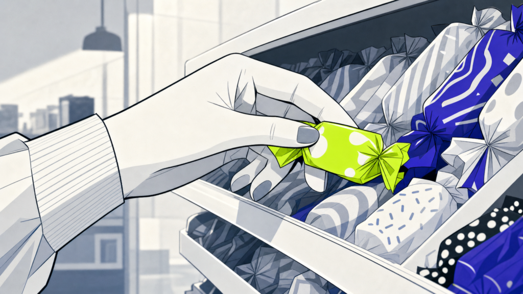
Candy branding is the strategic process of shaping how a confectionery product or store gets perceived, from visual identity and packaging to tone of voice and the moment a customer picks it up. In a category where shelf appeal and emotion drive the buy, branding is what separates forgettable sugar from beloved rituals. Whether you’re launching a boutique candy shop or scaling a packaged sweets line, MAVRK Studio covers what it takes to build a candy brand that sticks.
What Is Candy Branding
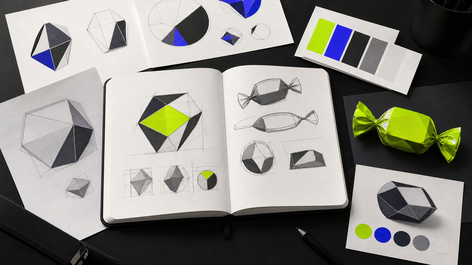
Candy branding is the coordinated system of logo, packaging, retail environment, color palette, typography, and voice working in lockstep to signal one identity. It is not a wrapper. It is not a mascot. It is the whole apparatus that makes a shopper reach for your bag instead of the one next to it. Studios that work in this space, including a food and beverage branding agency practice, tend to treat it as a full ecosystem rather than a graphic exercise.
Definition and Scope
At its core, candy branding covers everything a customer sees, touches, or reads before, during, and after purchase. That includes the primary logo, the palette, custom or curated type, pattern systems, packaging structure, retail signage, and the way the brand speaks on social. A useful reference for founders building this stack from scratch is our startup branding checklist, which maps the full identity system in one place.
Why Candy Branding Is Unique
Candy is one of the few categories where the purchase is driven by visual pull and emotional pop, not function. Nobody buys gummies to survive Tuesday. According to PRINT Magazine’s analysis of retail candy branding, brands from Brach’s to Sugarfina are built to evoke fantasy, escape, and joy. The category evolved from 19th-century penny-candy jars to sophisticated experiential retail by the mid-20th century, and it now demands identities that hold up at wrapper scale and storefront scale at the same time. That dual-scale demand is why smart founders think about interior design and pack design as one continuous surface.
In plain English: candy branding is how you make sugar feel like a story, at every size it shows up.
How Candy Branding Works
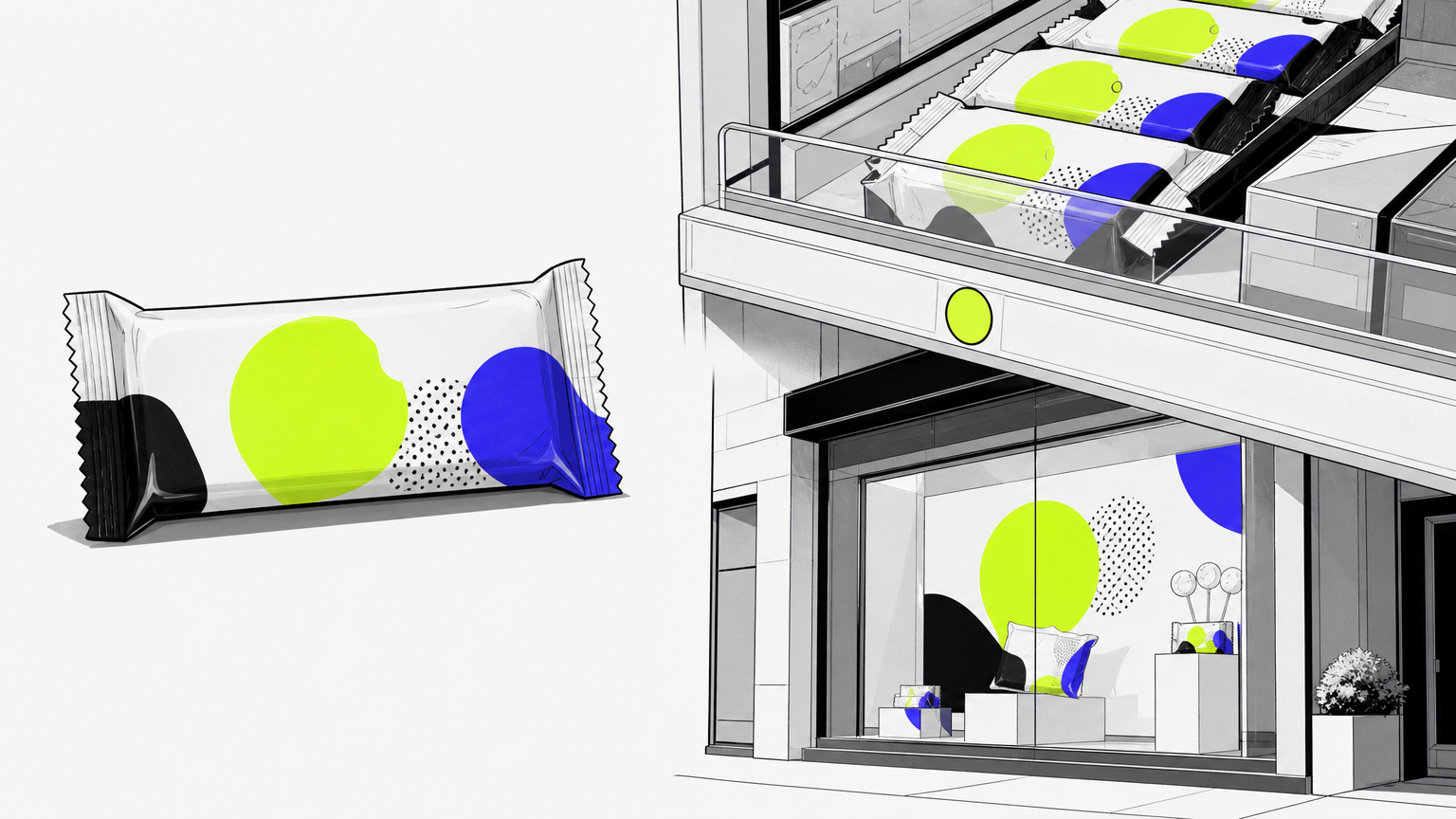
The mechanics come down to three layers working together: a visual identity system, packaging as the primary touchpoint, and retail plus environmental cues. Skip one and the brand feels partial. A modern beverage packaging design strategy plays by similar rules, and the parallels between drink and candy branding are useful reference points.
The Visual Identity System
A candy brand’s identity typically includes a primary logo, secondary marks, a defined color palette, custom or curated typography, and a pattern or icon set that shows up consistently across every material. Founders who want to understand how the logo fits inside this larger system can read the art of designing a brand logo for a walkthrough of the craft behind the mark.
Packaging as the Primary Touchpoint
Packaging is the single most important touchpoint in candy. It is often the only communication a shopper has with the product before they hand over money. Bright, saturated colors signal fun and indulgence. Muted pastels and minimalist layouts signal premium, which is why Sugarfina reads as an adult purchase rather than a kid one. Studios in this lane, including creative agencies in the food and beverage market, obsess over these choices because they set price expectation before the first taste.
Retail and Environmental Branding
Candy stores have used environmental branding as a competitive tool since the 1950s, when midcentury modern and Googie influences turned shops into playful fantasy worlds. Today those cues extend to Instagram-ready walls, short-form video moments, and unboxing shots. Digital surface work is now inseparable from physical retail, which is why our web design practice sits alongside pack and store design.
Section takeaway: identity, packaging, and environment are one system. Treat them separately and shoppers feel it.
Why Candy Branding Matters
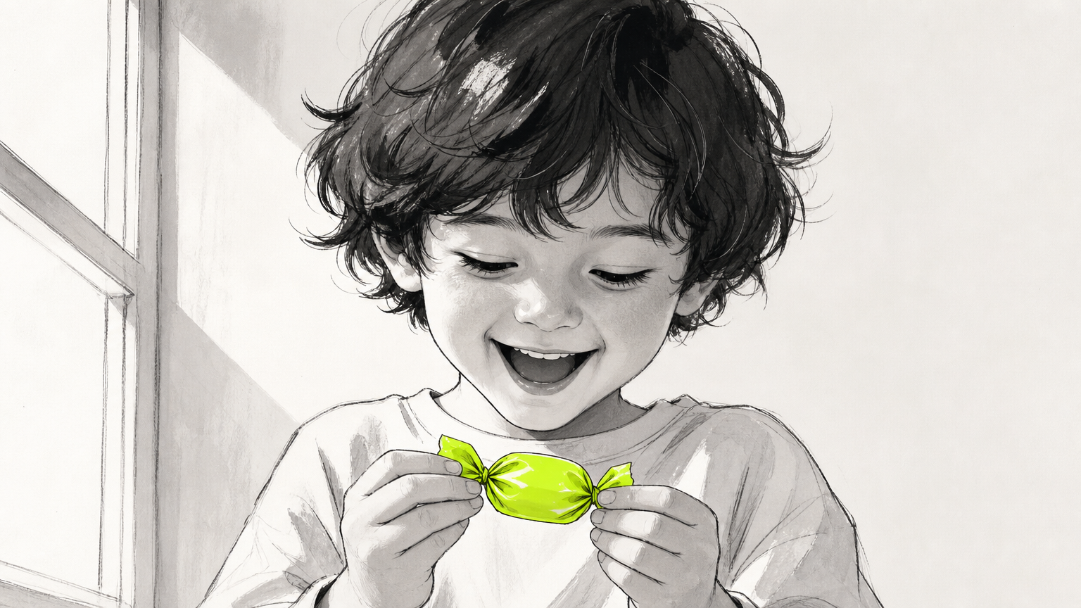
Humans have an evolutionary predisposition toward sweetness, so branding can plug straight into associations with pleasure, childhood, and celebration. That is rare emotional territory, and it deserves respect. Founders looking at the wider category conversation can start with our food and beverage marketing hub.
Emotional Connection and Purchase Behavior
Candy sits inside a very old set of feelings: reward, comfort, ritual, holidays. Brands that name a clear emotional promise, whether that is indulgence, nostalgia, or health-conscious enjoyment, earn stronger retailer placement and repeat purchase. The tactics that carry that promise onto social feeds are covered in our social media marketing practice.
Standing Out in a Crowded Market
The global confectionery aisle is thousands of SKUs deep. Visual differentiation is the primary driver of trial. If your bag reads like the three next to it, you lose, regardless of how good the product is inside. Founders comparing themselves to shelf neighbors should consider a brand growth audit to see where the identity actually lands versus where they think it lands.
Building Long-Term Brand Equity
Legacy brands like Brach’s, founded in 1904, and Loft’s, dating to the Civil War era, show that consistent visual identity sustained over decades builds recognition that survives product-line changes. A well-executed identity also reduces marketing costs over time because the product self-communicates on the shelf. That compounding effect is a recurring theme across our branding writing.
Common Candy Branding Misconceptions
Founders come into candy with strong instincts and, usually, one or two big misreads. Clearing those up early saves an entire rebrand cycle. Our take on when to correct course lives in our piece on refreshing a brand.
Misconception: Bright Colors Are Always the Right Choice
Reality: positioning dictates palette. Many founders assume candy must use rainbow, maximalist color. Premium confectionery brands consistently use restrained palettes to signal quality and justify higher prices. Positioning comes first, palette follows. If you sit in the premium tier, our writing on CPG covers how mature food brands hold that line.
Misconception: Logo Is the Whole Brand
Reality: brand is a system. A logo is one element inside a much larger apparatus. Without consistent typography, packaging, and voice, even a great mark fails to build recognition across touchpoints. Founders who want the fuller picture can review our packaging writing for how the mark behaves in context.
Misconception: Small Candy Businesses Don’t Need Formal Branding
Reality: branding sets perceived value. Small-batch producers who invest in professional identity see stronger wholesale placement and higher retail prices, because perceived value is set by presentation before the first taste. Nostalgia is a real lever here, though it can trap a brand that leans on retro without a contemporary twist. Brach’s own logo evolution, from a static baseline to a jogging, playful letterform, is proof that legacy brands still refresh. Our creative agency blog covers this evolution work regularly.
Related Concepts in Candy Branding
A few adjacent ideas belong in every founder’s vocabulary before the design work starts. These are the concepts that keep the brand extensible instead of boxed in. See our ventures blog for how these decisions play out inside operating businesses.
Brand Architecture for Candy Lines
Companies with multiple product lines choose between a branded house, where every product carries one master brand, or a house of brands, where each line has its own identity. The choice affects packaging cost and shelf recognition. Our thinking on this pattern is threaded through the hospitality writing, where the same architecture logic applies to restaurant groups.
Private Label vs. Branded Strategy
Private label competes on price and retailer relationships. Branded candy competes on consumer pull. The branding investment differs sharply between the two routes to market, and treating them as the same project is a common founder error. Anyone weighing an owned-brand play should look at our ventures work for context on building brands you actually control.
Seasonal and Limited-Edition Branding
Seasonal drops, Halloween corn, Valentine’s Day pinks, drive urgency and press coverage, but they require a modular system that flexes without losing core identity. Typography carries a lot of this weight: script fonts signal handcrafted, bold display signals fun, geometric sans-serifs signal modern and health-forward. Mascots still work for kid-facing product; adult confectionery increasingly uses abstract pattern instead. Founders building seasonal calendars can borrow from our influencer marketing playbook to amplify limited runs.
How to Get Started with Candy Branding
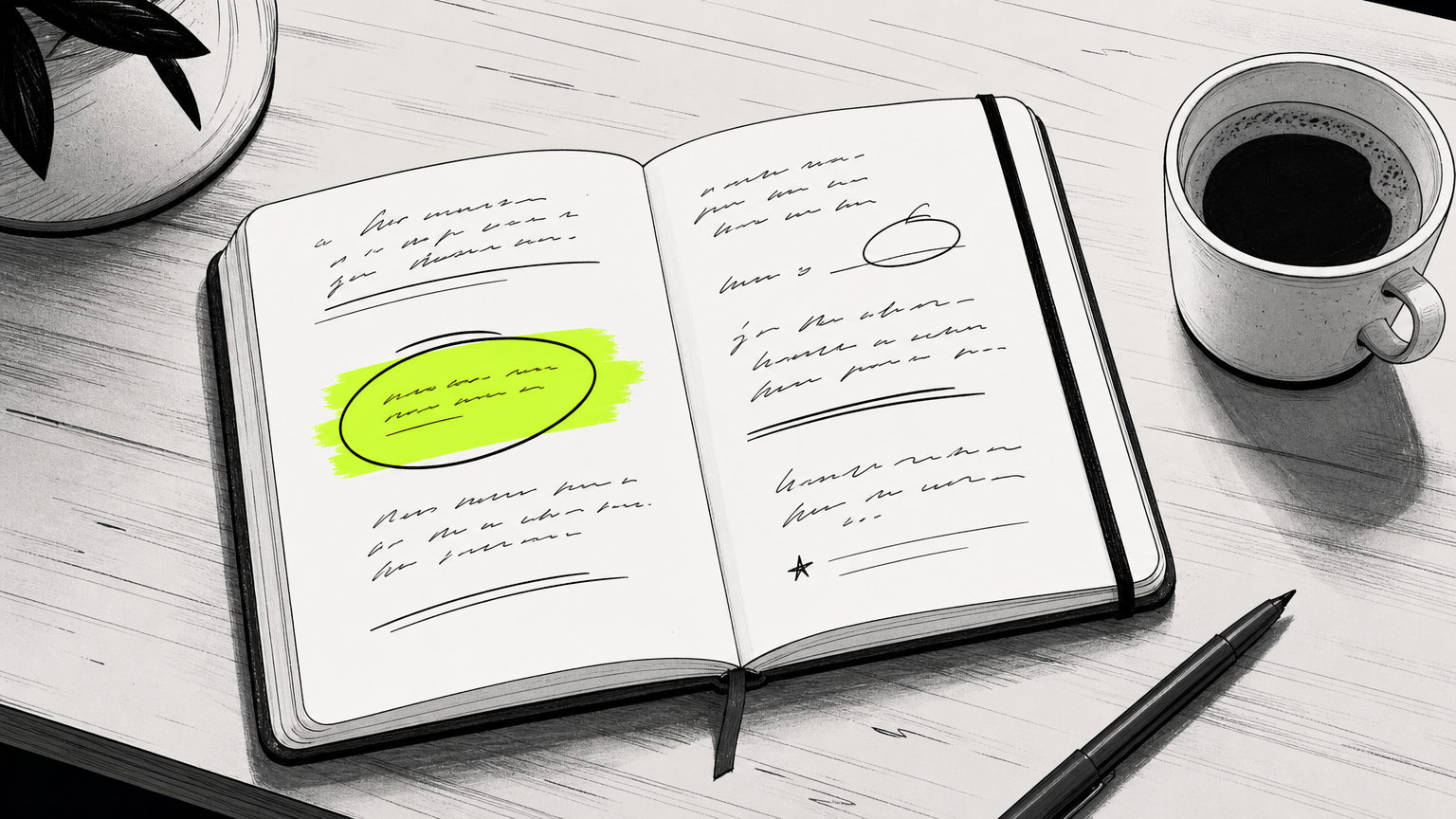
You do not start with the logo. You start with the position. Founders who reverse that order pay for it later. Our digital marketing blog has extended reading on getting the positioning right before touching visuals.
Define Your Brand Position Before Designing Anything
Nail the target consumer, the emotional promise, and the competitive set before any visual work begins. Skipping this step is the single most common cause of full rebrand projects two years later. Founders on a data-forward track can pull ideas from our writing on data-driven food service marketing to sharpen the target definition.
Build a Brief for Your Creative Partner
A solid candy brief covers target audience demographics and psychographics, intended retail channel (mass, specialty, DTC), price tier, three brands admired by the founder, and three brands the founder wants to be clearly different from. Request a full identity system as the deliverable, not just a logo file: logo variations, color codes, type specs, packaging templates, and a usage guide. Reference examples from our work show what a full system deliverable looks like.
Launch, Test, and Iterate
Test branding before a full production run. Farmer’s markets, pop-ups, and small-batch DTC drops give real consumer feedback on packaging before major spend. Then iterate on retail scan data, social engagement, and direct feedback as an annual practice. Founders building the DTC side alongside wholesale should read the ultimate guide to must-haves for your e-commerce website before launch.
Frequently Asked Questions
What makes a good candy brand identity?
A good candy brand identity is cohesive across every touchpoint: logo, packaging, typography, color, voice, and retail environment. It signals a clear emotional promise, holds up at wrapper scale and storefront scale, and stays recognizable through seasonal variants.
How much does candy branding cost?
Candy branding costs range widely, from a few thousand dollars for a solo designer producing a basic logo package to well into six figures for a full identity system with packaging structure, retail environment, and digital surfaces from an experienced studio.
What colors work best for candy packaging?
Colors follow positioning, not category habit. Bright, saturated palettes signal fun and indulgence for mainstream product. Muted pastels and restrained neutrals signal premium and adult positioning. Test palette choices against your price tier and target shelf neighbor.
How do I name my candy brand?
Start with the emotional promise and target consumer. Test names for pronunciation, trademark availability, domain access, and how they read on a wrapper at arm’s length. Avoid inside jokes that only make sense once someone already knows the brand.
What should be included in candy packaging design?
Packaging design should include structural format, primary and secondary graphics, ingredient and nutrition compliance, barcode placement, seasonal or SKU variants, and a clear front-of-pack hierarchy. It should also anticipate how the pack photographs for social and e-commerce.
How do small candy businesses compete with big brands?
Small brands compete on identity clarity, story, and specificity, not scale. Sharp positioning, distinctive packaging, and a focused retail or DTC channel let independents earn premium price points that mass brands cannot access without cannibalizing their core lines.
When should I rebrand my candy company?
Rebrand when the current identity blocks growth: flat retail placement, weak differentiation on shelf, misalignment with a new target consumer, or a product line that has outgrown the original mark. Refresh regularly; overhaul rarely.
What is the difference between candy branding and candy packaging design?
Candy branding is the whole system, including positioning, voice, identity, and retail experience. Packaging design is one execution surface inside that system. Packaging without branding is decoration. Branding without packaging is theory.
Wrapping Up
Candy branding rewards founders who treat it as a full system rather than a logo assignment. Nail the position first, build a modular identity that flexes across wrapper, shelf, and feed, and iterate on real consumer signal instead of internal taste. The brands that last, from Brach’s to today’s boutique upstarts, all did the same thing: they built an identity worth remembering. If you’re ready to build one, MAVRK Studio works with candy and confectionery founders on exactly this kind of build.