When you walk into any retail aisle, you’re immediately greeted by competing product visuals like logos, taglines, and illustrations all begging for your attention but none speak louder or faster than color. Brands that use color blocking effectively often capture the consumer’s attention.
Color blocking is a strategic move since it uses large and contrasting color fields to create visual impact and product cohesion. For marketers and brand managers, the shelf is no longer just a point of sale, it’s a battlefield for visibility.
This blog explains how color blocking is transforming packaging and retail displays into customer-converting assets.
What is Color Blocking?
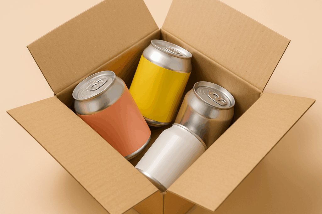
Color blocking is the practice of intentionally arranging color segments to generate contrast and clarity in design. Rather than depending on a patchwork of graphic components, marketers are embracing strong blocks of color to guide the eye, express product categories, and unify visual merchandising. This strategy enables rapid brand awareness and a more memorable shelf presence, particularly in the food and beverage industry.
In packaging, color blocking may imply designating one distinct color to each product SKU in a line while keeping the layout, typography, and brand logo consistent. To maximize visibility in exhibits, put like-colored objects together or use backdrops and lettering in matching colors.
How Color Blocking Sells Products
Color blocking turns browsers into buyers by using visual hierarchy to grab attention. Since 94% of first impressions are design-based, shoppers often decide with their eyes before noticing the product name.
Color blocking plays on our natural inclination to notice high-contrast areas and seek visual order. This technique helps brands:
- Clarify product lines by color-coding categories or variations
- Guide customer focus to hero products or bundles
- Simplify decision-making for overwhelmed shoppers
- Enhance brand recall through consistent color use
Why Color Blocking Works
At the heart of color blocking is an understanding of human psychology. We’re wired to respond to visual cues before we engage with text or product details. Color affects human emotions, influences perception and most importantly for retail, it drives behavior.
Psychologists have long known that certain colors evoke specific emotional reactions. Red can create urgency or appetite while blue promotes trust and calm. But when these colors are used in bold and intentional blocks rather than subtle gradients or accents, the message becomes louder and clearer.
According to a Journal of Consumer Research, product color affects up to 90% of quick decisions about buy intent. Color blocking goes a step further by establishing a visual rhythm that directs buyers across a shelf or product line without using words.
Packaging with Purpose: Using Color to Influence Shoppers
Your packaging is your most visible and permanent marketing asset. It sits on shelves long after ad campaigns end and directly interacts with consumers. That’s why using color blocking in packaging design is more than just aesthetics.
Color blocking in packaging helps:
- Reinforce brand hierarchy (e.g., Core vs. Limited Editions)
- Visually separate SKUs without losing brand cohesion
- Create a consistent unboxing or shelf experience across multiple platforms
Take brands like Tony’s Chocolonely. Their packaging uses blocks of color to organize flavor lines and evoke emotion. A chocolate bar wrapped in red communicates boldness or spice and pastel blue signals calm or creamy. Yet the layout, fonts, and structure remain the same anchoring it all to the brand identity.
Role of Color Blocking in Retail Displays
Color blocking doesn’t end at the packaging. In fact, it becomes even more powerful when extended into your retail display strategy. Think of your display as the stage and color is the lighting that pulls the spotlight where it matters.
In retail displays, color blocking helps:
- Anchor seasonal or promotional zones
- Create “visual stops” that slow down shopper movement
- Emphasize brand families across shelf space
- Provide contrast against competitors
Smart retailers coordinate signage, backdrops, floor displays, and product facings to create a single and immersive color story. A monochromatic endcap with bold product blocks can turn a passive shopper into a curious browser. For CPG brands working with big-box or boutique partners, designing co-branded color strategies can strengthen in-store presence.
7 Smart Ways to Make Color Work for Your Retail Display
Ready to apply color blocking in the real world? Here are seven tested strategies that go beyond just choosing the right hues:
- Create a focal point: Use bold color blocking at eye level to draw shoppers in.
- Use contrast to your advantage: Light-on-dark or color-opposite schemes catch the eye faster.
- Group by hue: Align SKUs or sets by color family to create visual harmony.
- Match display backgrounds with packaging: This expands your brand’s perceived footprint.
- Keep the layout clean: Avoid overcrowding, let each color block breathe.
- Seasonal swaps: Update your color story during holidays or campaigns.
- Test A/B variations: Use pilot locations to compare color-blocked displays vs. standard ones.
Let Your Packaging Speak in Color
In today’s hyper-competitive retail landscape, visual clarity wins. Brands that use color blocking not only stand out but they also communicate faster, connect deeper, and convert better. Whether it’s on a label or an endcap, the message is the same, your packaging speaks. Make sure it speaks in color.
Want to bring more stopping power to your packaging and displays? Partner with MAVRK Studio to create standout designs that drive sales and build lasting brand loyalty.