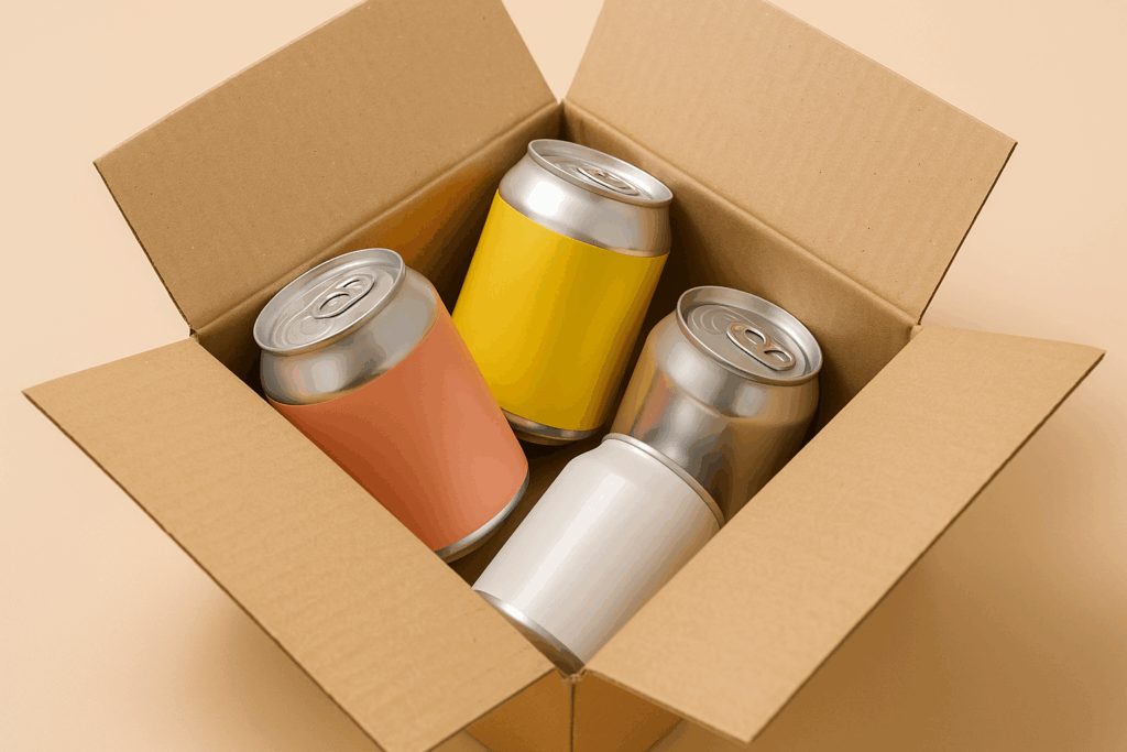
A customer walks into a store or browses an online shop. In just a few seconds, they decide what to buy, not always because of the price, but because of the packaging design. In food, beverage, and consumer goods, packaging does more than hold the product. It works as your salesperson, your brand’s face, and a tool to meet legal rules.
Avoiding packaging design mistakes helps protect your brand and boost shelf appeal. With thoughtful design, your packaging can become a powerful brand asset. This blog looks at common packaging design mistakes using real examples from food & beverage brands.
Skipping the Strategy Phase
You have good products and a designer ready to work. But if you start with the packaging design before planning, you’re already making a mistake.
One of the biggest packaging design mistakes is skipping the strategy step. Before designing, you need to understand your brand’s position, your target customers, and your competitors. Packaging should follow a clear plan, not just what looks nice.
For example, a small coffee brand released cold brews in simple glass bottles. The design looked clean, but sales were low. The label didn’t highlight what made the product special, like being organic, using direct trade, and having low acidity. Consider those things that the customers cared about.
According to Pulse Marketing Agency, packaging is your product’s first impression and without a clear strategy, that first impression might miss the mark.
🔍 Tip: Don’t skip brand discovery sessions or consumer persona work. Your packaging design must reflect the brand promise, not just the founder’s taste.
Ignoring Compliance and Labeling Laws
In industries like food & beverage, following the rules is just as important as good packaging design. A nice-looking package that breaks legal rules can cause delays, fines, or even a product recall.
This kind of error is one of the most costly packaging design mistakes. Not because the design was bad, but because it left out something important.
Here’s a basic compliance checklist for packaging in the Food & Beverage space:
- Nutritional info meets local regulations (USDA, FDA, EU, etc.)
- Allergen declarations are clear and properly formatted
- Claims like “organic” or “non-GMO” are certified
- Country of origin and expiration dates are legible
- Barcodes and recycling symbols are correctly placed
💬 Question: Have you checked your latest packaging against every regulation in your target market?
Relying Only on Digital Mockups
Digital mockups can be useful but they’re often misleading. A flat design or 3D mockup may not account for print finishes, material textures, or how your packaging behaves under store lighting and stacking.
One DTC protein bar startup learned this the hard way. Their digital mockups showed a bright, energetic palette meant to stand out in the health aisle.
But once printed on matte recycled board, the colors dulled and blurred. The package looked faded on the shelf, and customer feedback on social media pointed to poor presentation.
Among the most overlooked packaging design mistakes is failing to prototype early. A few printed samples tested under real-world retail lighting can expose flaws that digital mockups hide. Testing physical samples helps ensure your design translates as intended.
💡 Tip: Always review physical packaging samples before going to print, especially if you’re using specialty inks, foils, or sustainable substrates.
Product Fit and Shelf Space Are Afterthoughts
Great packaging isn’t just about appearance, it’s about practicality. One of the most overlooked packaging design mistakes is failing to ensure that the packaging suits the product and the environment where it’s sold or used.
For example, a new juice brand launched in tall and slim glass bottles. While the design looked clean and modern, the bottles tipped over easily on crowded grocery store shelves. Retailers complained, and the brand had to switch to a more stable bottle shape to stay in stores.
This highlights a key lesson that form must follow function. For food & beverage brands, packaging must work within real-world limits like shelf height, storage conditions, and stacking requirements to perform well in retail settings.
Here’s a quick checklist to evaluate packaging fit:
|
Factor |
Consideration |
| Shelf Compatibility |
Will it sit properly in standard retail fixtures? |
|
Stackability |
Can it be shipped and displayed without damage? |
| Portion Control |
Is the size appropriate for single-use or multi-use? |
|
Environmental Conditions |
Will it hold up in heat, humidity, or refrigeration? |
| Space Efficiency |
Is it too bulky relative to product volume? |
Using Incorrect Dielines and Print Specs
A dieline isn’t just a template, it’s the technical foundation of your packaging. To ensure that your design is accurate from screen to shelf, consider it the architect’s blueprint, with each panel, fold, bleed, and cut line precisely measured. Using an outdated or incorrect dieline is one of the most costly packaging design mistakes, especially when you’re producing at scale.
These problems frequently occur when creative teams rely on generic dieline templates or expect that printers will “fix it in production.” The majority of print partners actually follow dielines to the letter and won’t alter your design until you ask them to.
Misaligned dielines can also throw off barcodes, nutritional labels, or legally required information, creating compliance issues that delay product launches.
Common problems from incorrect dielines:
- Artwork shifted due to poor bleed setup
- Cutter guides not matching actual trim lines
- Missing glue flaps or structural reinforcements
- Incompatible file formats or color profiles
💡Tip: Always get dielines directly from your production partner, not from generic templates online. And test your print files with a press proof if budget allows.
Designing for Your Team, Not Your Customer
When internal stakeholders start driving packaging decisions based on personal preference rather than customer insight, you risk misalignment with your target audience. That’s one of the more overlooked yet critical packaging design mistakes.
In the food & beverage industry, the customer journey starts well before the first bite. If your packaging doesn’t clearly communicate the product’s use case, flavor, and benefits in just a few seconds, you’re losing attention and revenue.
Use research instead of internal opinion as your compass. Conduct A/B testing, collect in-store shopper feedback, and look at what packaging styles actually perform well in your category. Trends are helpful, but only when filtered through consumer behavior and brand positioning.
💬Question: Are you designing for your customer, or just trying to win over your leadership team?
Copying the Competition Too Closely
There’s a difference between category familiarity and brand mimicry. While it’s smart to reference visual trends in your product segment, copying your competitor too closely creates confusion and erodes brand identity.
For example, A newer brand launched with pastel cans, minimalist fonts, and fruit illustrations that is so close to LaCroix that consumers mistook it for a store-brand lookalike. Despite solid distribution, the brand saw slow traction.
It wasn’t until they revamped their design with bolder graphics and a differentiated color scheme that they began building real shelf presence.
The core issue is when you look like everyone else, you’re easy to overlook. This is one of the most common packaging design mistakes in saturated categories.
“When packaging is driven by ego instead of insight, the customer is the one who pays—and eventually walks away.”
Strategic Packaging Begins with Avoidance
Avoiding packaging design mistakes isn’t about playing it safe, it’s about designing with purpose. Every dieline, color palette, and font choice must align with your strategy, your consumer, and your market realities.
By staying consumer-focused, compliance-aware, and production-savvy, your brand can avoid costly reworks and maximize shelf impact.
Need expert help with packaging that converts and communicates? Contact us or book a consultation to elevate your next launch.